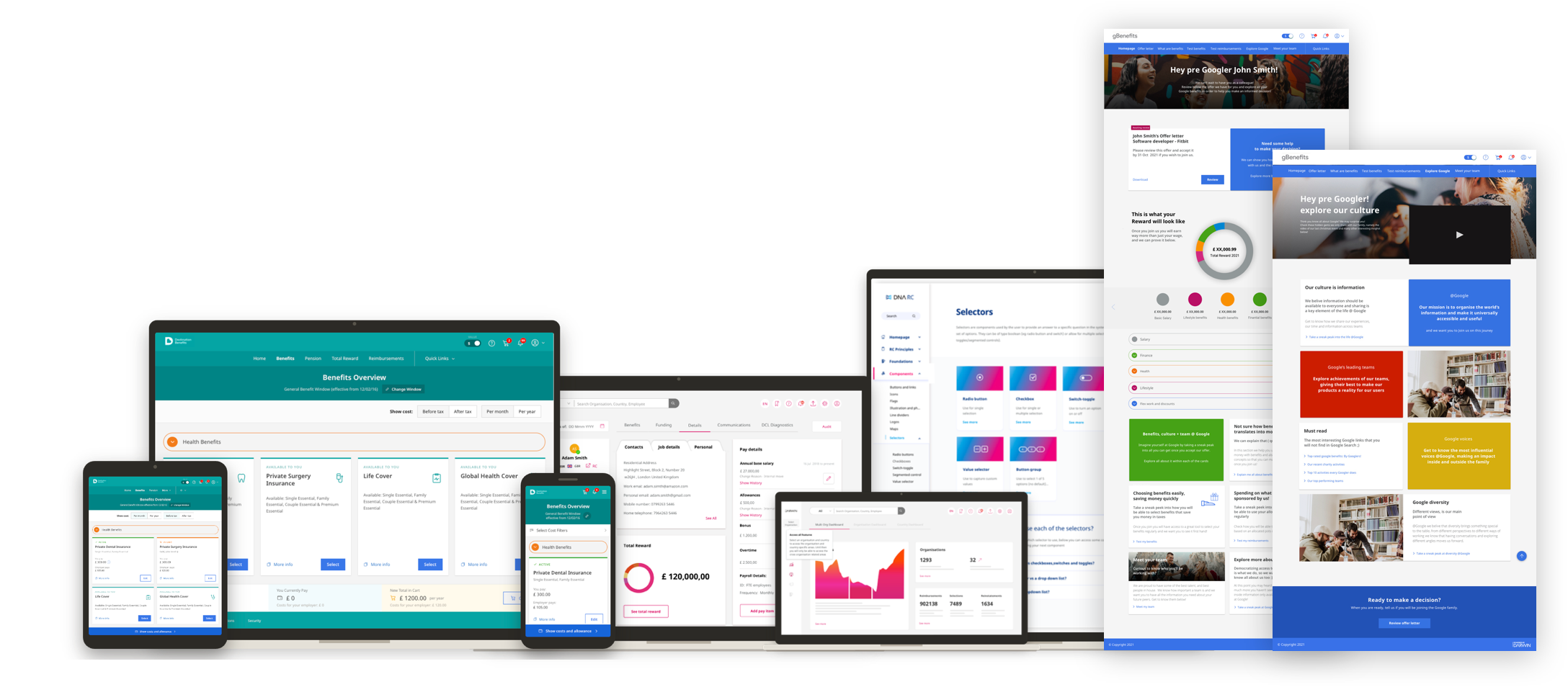
The four products of the benefits ecosystem: Pre board Portal, Reward Centre, Control Centre and the Design System family
The outcome

1 benefit, 4 hands: engineers build the template, HR tailor and administer it, employees select it, candidates see it before day 1.

2.5M

Employees able to select benefits on any device, at home or at work.

3

Connected products brought under one Design System family.

#1 award

Innovation award for the Pre board Portal, and a place on the roadmap.

Project overview

One experience, four audiences

Employee benefits only feel simple at the end of a long chain. Engineers build the templates, HR specialists configure the template, administer and report on benefit selections, and employees make their choices inside whatever those decisions allow, with a Design System family holding every step of it to the same language. All of it supports a benefit selection web app with 2.5 million users and around 60,000 people logging on per day inside an eight hour peak.

I worked across that whole chain: the responsive portal employees select in, the platform HR specialists configure it with, a new portal that extends the offer to people who have not yet joined, and the Design System that holds the family together. Every decision had to hold at that scale, across three breakpoints and across multinational client configurations.

The four workstreams

Portal transformation
Reward Centre

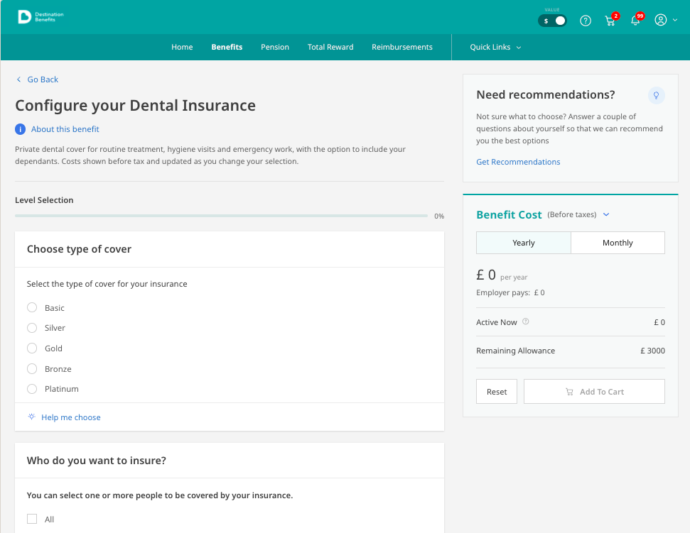
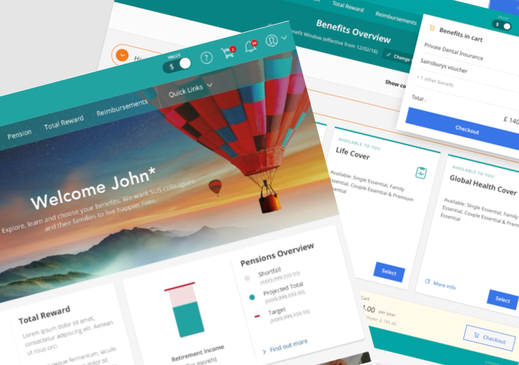
For employees. Redesigning benefit selection around a shopping cart and a responsive, multi-device approach.
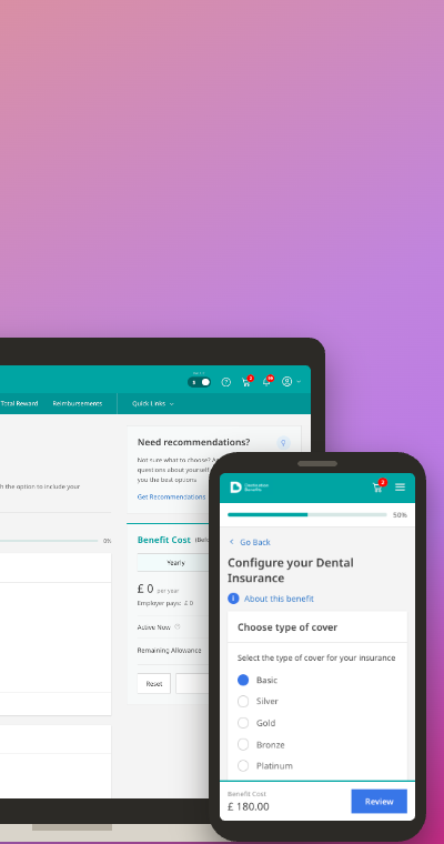
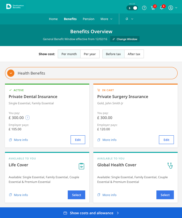
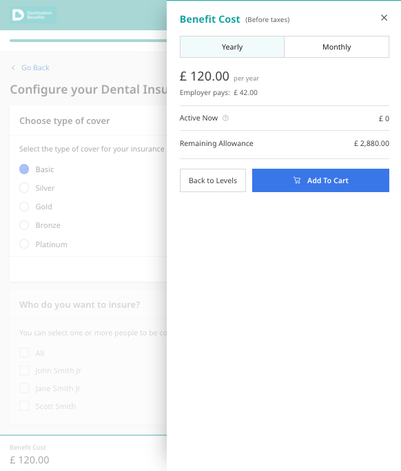
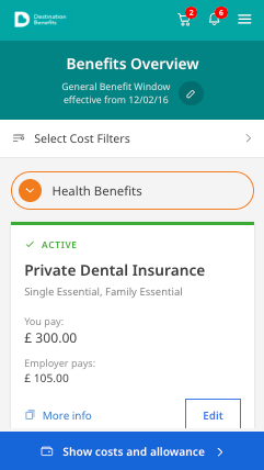
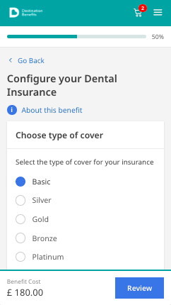
Reward Centre benefit configuration on laptop and phone
Platform transformation
Control Centre

For HR specialists & engineers. Redesigning platform navigation and adding new capability: reusable benefit templates and a detailed employee record.
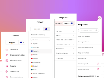
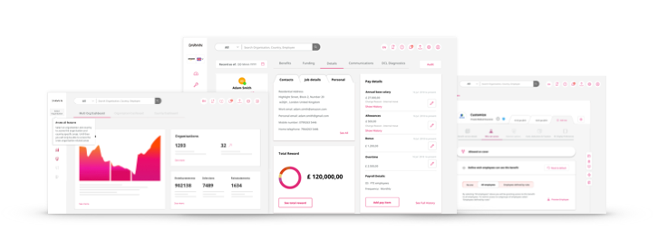
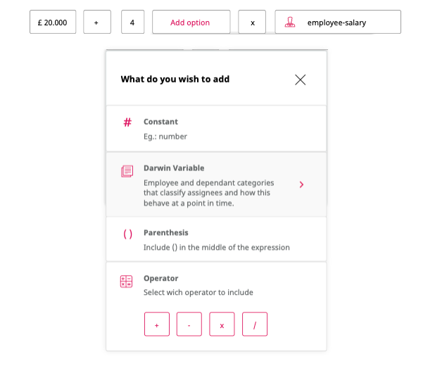
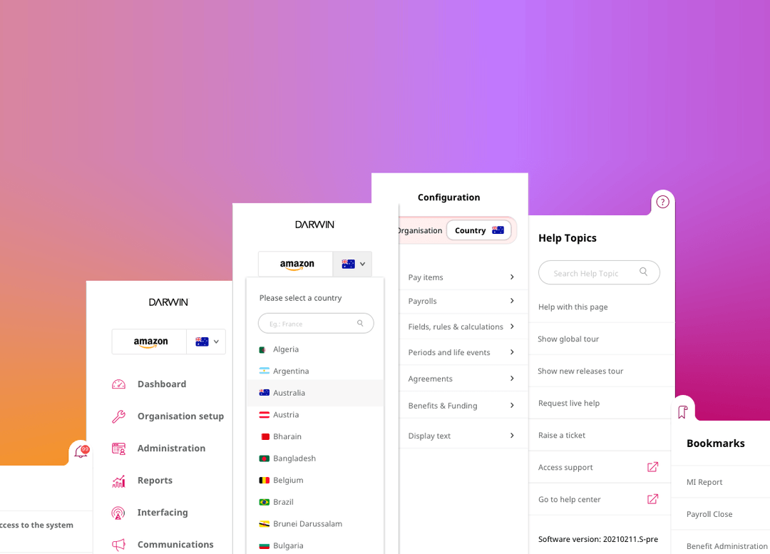
Control Centre configuration screens
Ecosystem expansion
Pre-hire portal

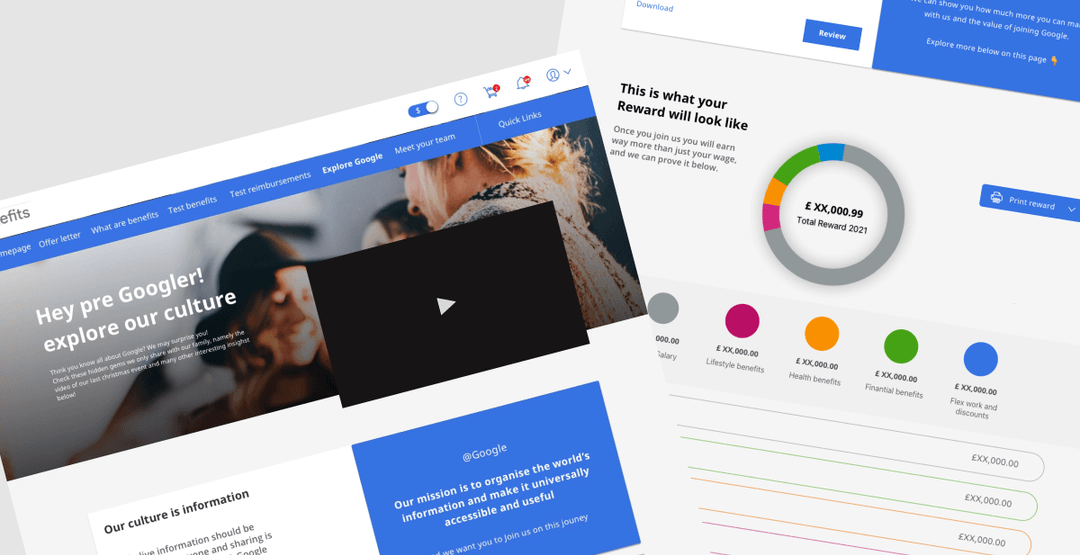
For pre-hires. A portal where future employees accept an offer, with benefits as the main driver. Winner of an internal innovation award.
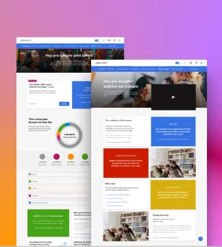
Pre board Portal welcome and culture pages as a pre-hire sees them
Ecosystem unification
Design system family

Two disconnected systems consolidated into one family with consistent patterns across B2B desktop and B2C responsive products.
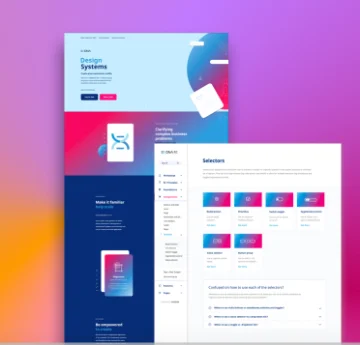
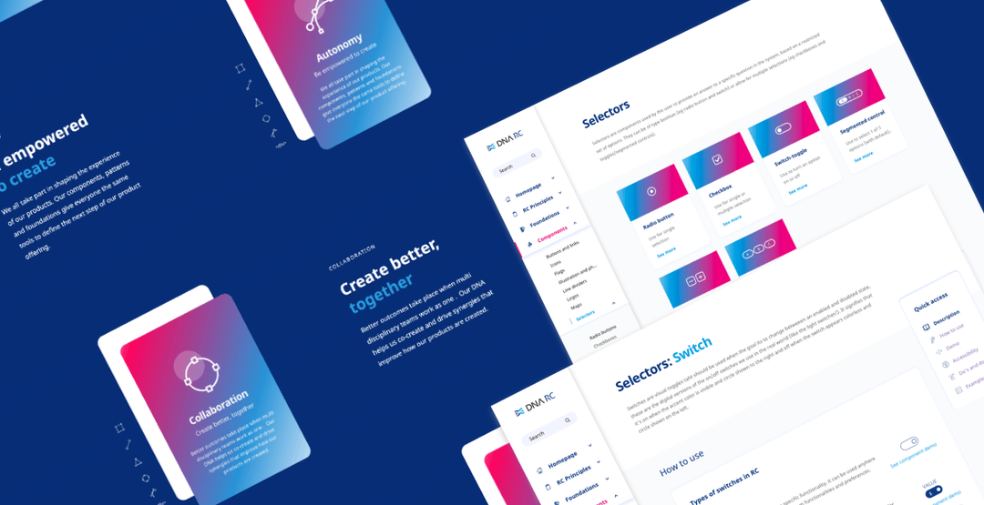
Design System family: documentation site and component selectors

My role

01

Ownership

  • Owned design end to end across Control Centre, the Pre board Portal and the Design Systems.
  • Onboarded and mentored the designers who extended those capabilities and components.
  • On Reward Centre an agency set the initial brand baseline. I managed that partnership and led the UX: the portal experience, the shopping cart flow, responsive progressive disclosure, and scaling it to a multi-device Design System.
02

Research that set direction

  • Multinational generative study, 60+ participants across the UK, Romania, Japan and Singapore.
  • Usability studies at every scale, from 100+ participant quantitative rounds to 5 participant sessions.
  • Benchmarked 60+ Design Systems, plus surveys with 100+ members and co-creation workshops.
03

Foundations others built on

  • A four tier IA, six reusable page templates, progressive disclosure patterns for tablet and mobile, and two Design Systems unified into one family - so designers worked autonomously across multiple platform areas. I onboarded and mentored each one who joined.
04

Alignment across the chain

  • Kept product, engineering and business aligned through service blueprinting, journey mapping per-story reviews and a shared UX debt log, and proved the value of UX well enough to secure budget for further research and buy-in to extend the product offering.
Craft & skills applied
Multinational research Generative & evaluative studies Information architecture Cross-device UX Service blueprinting Journey mapping Design Systems Design sprints Mentoring & onboarding Cross functional leadership Stakeholder alignment Engineering handoff Trade-off prioritisation UX debt governance

Execution

Users and tasks per product

The four products only make sense as one chain. What engineers build as templates is what HR specialists configure, what administrators run and report on, and what employees finally see when they choose a benefit.

Control Centre
Reward Centre + Pre-hire
Engineers

Build
templates

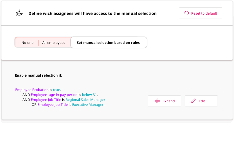
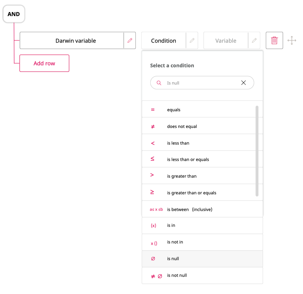
Write variables that translate into templated UI controls that HR can adjust.

Configurators

Customise
templates

HR specialists shape each client scheme without engineering help.

Administrators

Administer
benefits

HR specialists manage selections and report on take-up across the workforce.

Employees

Select
benefits

2.5 million employees choosing their package on any device.

Design system family

Products

Explore an overview for each product below: the gap it started from, the approach taken and what changed as a result. Use the segmented control to see how I shaped each experience, and how they connect as one ecosystem.

Multi-device B2C portal redesign

Redesigning benefit selection around a shopping cart and a responsive, multi-device approach.
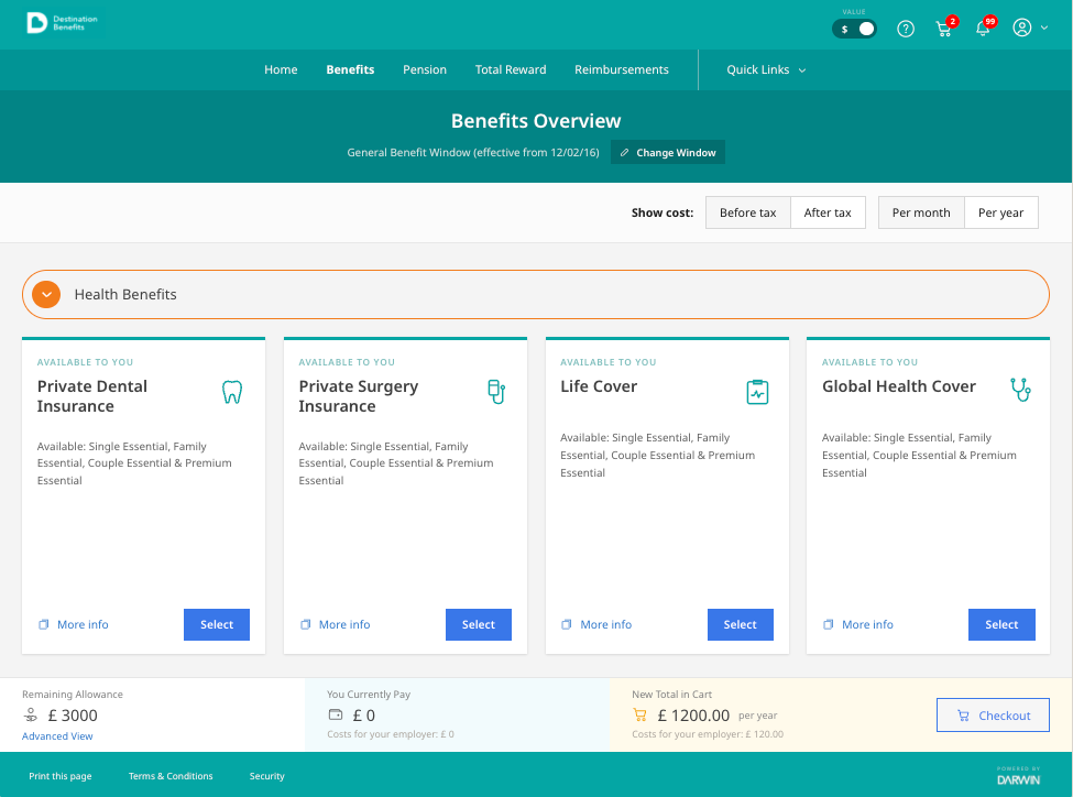
Desktop overview Desktop configuration
Tablet overview Tablet configuration
Mobile overview Mobile configuration
Overview to configuration at each breakpoint: four cards per row on desktop, two on tablet, one on mobile, with the cost panel beside the form, sliding over it, then fixed to the foot of the screen.

Overview

From

Desktop-only, single-benefit selection constraining 2.5 million users to workplace access.

To

Cross-device responsive platform with an integrated shopping cart.

Vision

Turn a fragmented benefit-by-benefit process into one multi-device selection experience: a shopping cart that holds the whole package, and repaired flows where benefits depend on each other.

The work in three moves

Opportunity

The gap

  • Selection was desktop-only and ran one benefit at a time, so 2.5 million employees could only choose at work.
  • Dependencies between benefits were invisible.
  • Supporting flows such as enrolment periods and login were broken along the way.
  • There was no Design System in place, so every screen was built from scratch.
Process

The approach

  • Analysed benefit access models and enrolment periods.
  • Audited the broken flows: login, dependant selection and allocation, and single, cross and interdependent benefit selection.
  • Designed a cart paradigm for multi-benefit scenarios and multiple flows across interconnected journeys.
  • Validated with business expert reviews and moderated, task based testing across the three breakpoints.
  • The only project of the four in this case study with an agency phase: the agency set the initial brand baseline. I managed that partnership and led the UX: the portal experience, the shopping cart flow, responsive progressive disclosure, and scaling it to a multi-device Design System.
Outcome

What it changed

  • Employees could choose on any device rather than being tied to a work desktop.
  • Dependencies, changes to existing selections and mutually exclusive options were made clear.
  • Login tickets fell 93% and the cart removed 20% of the steps.
  • It earned me the lead role in redesigning the legacy configuration and administration tool, Control Centre, with buy-in to secure budget for a multinational research programme on that project.
  • It also earned buy-in to create a Design System for this project, later expanded to a Design System family across products.
  • The work supported the parent company acquisition.

Key numbers

20 %

Fewer steps to complete benefit selection with the shopping cart.

93 %

Fewer login related customer support tickets after the password reset flow was fixed.

2.5 m

Employees able to select benefits on any device: desktop, tablet and mobile.

Full case study
Redesigning a B2B configuration and administration platform

Restructuring the platform's navigation and extending capability: centralising employee administration and introducing reusable benefit configuration templates.
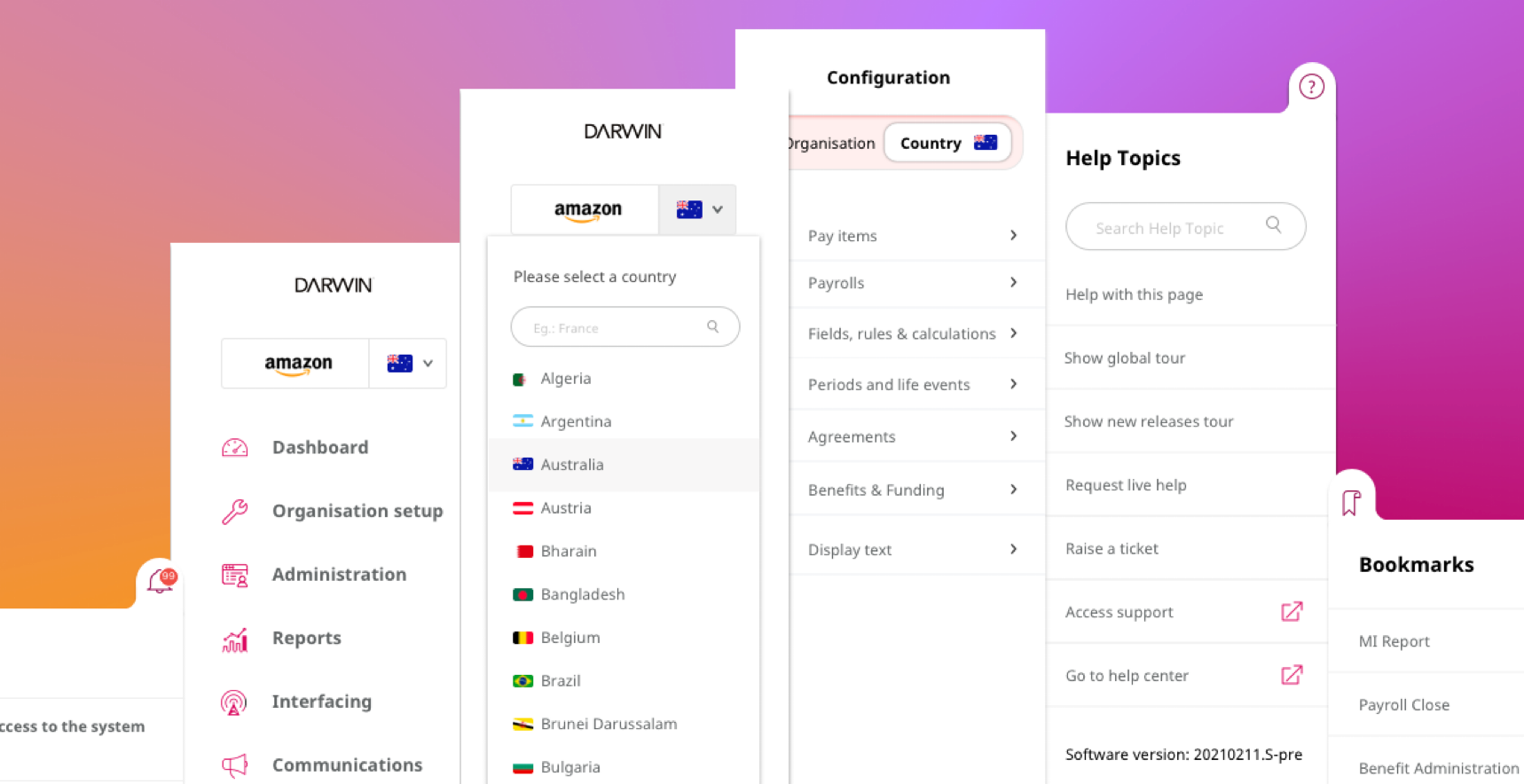
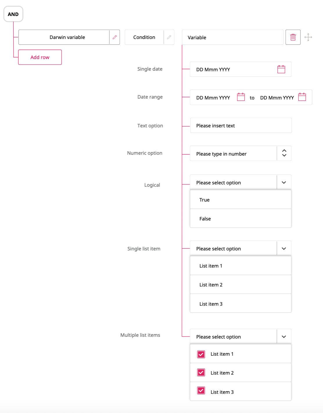
Organisation setup navigation, country selection and the configuration menu that replaced dozens of side tabs.
Navigation
Admin & Config
Access rule
Condition
Variables
Expression
Organisation setup navigation, country selection and the configuration menu that replaced dozens of side tabs.

Overview

From

A fragmented legacy tool for configuration, administration and reporting, spread across dozens of disconnected side tabs.

To

A unified B2B platform rebuilt end to end: a four tier navigation hierarchy, reusable configuration through benefit templates, administration built around a detailed employee record.

Vision

Turn a complex configuration and administration tool into a scalable platform where engineers define templates for HR specialists to reuse, and HR specialists configure, administer and report on the employee selection experience.

The work in three moves

Opportunity

The gap

  • Configuration lived across dozens of disconnected side tabs.
  • HR specialists could not find features when they needed them.
  • Setups for organisations, countries and schemes could not be reused.
  • Servicing an employee meant impersonating them, with no scoped view of who an admin could support.
  • No views tailored to the user: multi organisation for internal admins, organisation wide for cross country specialists, single country or scheme for HR specialists with a smaller scope.
  • Multiple flows were broken across administration, reporting and configuration.
  • Scenarios from common to edge case were unsupported, such as reinstate versus rehire rules for benefit allocation.
Process

The approach

  • A multinational research programme with 60+ participants across four countries.
  • I set the foundations for the IA, patterns and Design System.
  • A four tier navigation architecture with progressive disclosure and six reusable page templates.
  • Quantitative studies with 100+ participants assessed individual components, shaping capability like benefit templates and UX debt tracking.
  • Multiple rounds of usability testing across navigation, administration and configuration.
  • Onboarded and mentored four designers on the personas, user needs, IA and Design System, and partnered with them on cross platform features.
  • Built a full process to log, triage and clear UX debt, which outlived my time at the company.
Outcome

What it changed

  • Configuration moved into one predictable place, so HR specialists could set up benefits without hand holding.
  • Reusable templates cut complex benefit setup from months to weeks, and simple ones from hours to minutes.
  • A detailed employee record replaced impersonation.
  • Configuration became reusable at both levels: organisation setup such as salary items defined once across countries, and benefit setup through templates.
  • Views matched the user type: multi organisation for internal admins, organisation wide across countries, or a single country or scheme.
  • New use cases were supported, from everyday administration such as auditing employee pay and benefit data to edge cases such as reinstate versus rehire rules.
  • UX debt tracking kept quality measurable.

Key numbers

60 +

Participants researched across 4 countries: UK, Romania, Japan and Singapore.

25 7

Top-level navigation items reduced to seven areas with progressive disclosure.

142

Issues resolved through the UX debt log, which made quality measurable and trackable.

Months weeks

Complex benefit setup with reusable templates, and hours to minutes for simple ones.

0 impersonation

A detailed employee record and a scoped permission model replaced logging in as the employee.

4 tiers + 6

Four navigation tiers and six reusable page templates, which sped up every designer onboarded onto the project.

Related case studies
Expanding the platform across the user journey

Extending the product family with a portal for future employees to accept an offer, with benefits as the main driver to accept.
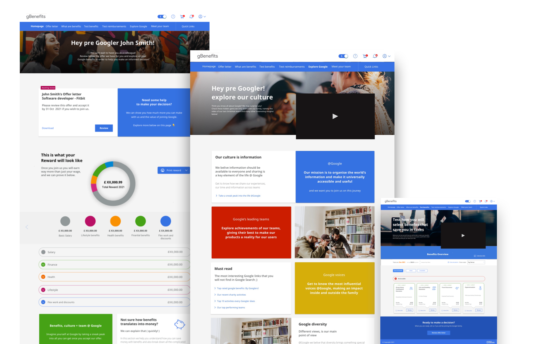
Pre-hire portal screens: offer letter, reward breakdown and culture pages
The Pre board Portal: offer review, a breakdown of what the reward package would look like, and culture content to support the decision.

Overview

From

A B2C portal serving current employees only.

To

A product family spanning pre-hire, onboarding and the employee lifecycle.

Vision

Show pre-hires the full value of their benefits, with signing the offer letter as the hook. Prove a week long sprint could bring the idea to life, and that reusing the platform IA and Design System could take it to market fast.

The work in three moves

Opportunity

The gap

  • Nobody was designing the moment just before employment: the offer stage.
  • That stage was still handled manually and offline, where a candidate decides whether the package is worth saying yes to.
  • I wanted to shape how people understand benefits, so a candidate judges an offer on total reward rather than base salary alone.
  • The business case followed: revenue scaled with headcount and the selections employees made, so pre-hires who grasp the full value are more likely to join and to optimise their selections later.
Process

The approach

  • I framed the business idea and assembled the team.
  • Ran the work as a week long, fully remote design sprint during an innovation week.
  • We researched with business experts, then co created customer journey, IA, wireframes, I elevated it to high fidelity design and the engineer on the team translated it into working coded demo inside the same sprint.
  • Tested with internal users before the pitch.
Outcome

What it changed

  • The concept won the company innovation competition.
  • It went onto the roadmap with unanimous stakeholder buy-in.
  • It showed the business that user centred design does not derail delivery dates: research, design and a tested demo fitted inside one agile week.

Key numbers

#1 award

Innovation award winner amongst 80 ideas submitted company-wide, and a place on the product roadmap.

5 days

From framing to a fully functional coded prototype, with the team aligned throughout.

200+

Colleagues at the follow-up methodology presentation session, which secured buy-in for UX processes.

Full case study
Creating consistency across the ecosystem

Creating 2 Design Systems - one for B2B desktop, one for B2C cross device - then unifying them into a single family on shared foundations.
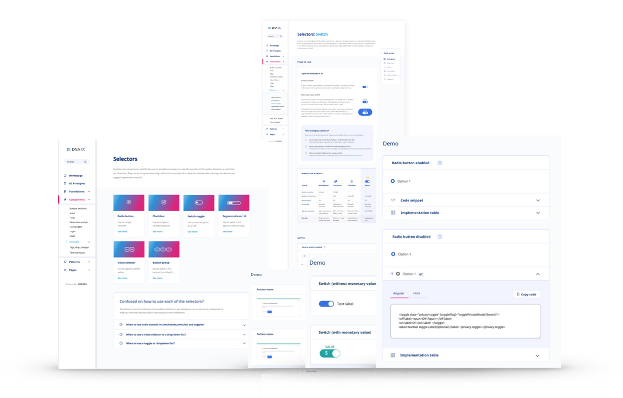
Design system family site and the selectors component page
The system family site and component documentation, including guidance on when to use each selector.

Overview

From

2 disconnected Design Systems serving separate B2B desktop and B2C responsive products.

To

1 unified Design System family with consistent patterns across the portfolio.

Vision

Leverage the existing desktop system architecture to create a scalable family spanning platforms and breakpoints.

The work in three moves

Opportunity

The gap

  • Neither product had a Design System when I arrived: Reward Centre started from a directional agency styleguide, Control Centre from a legacy interface with no shared foundations.
  • The two systems then grew separately for B2B desktop and B2C responsive, so the same pattern was solved twice and neither team could rely on the other.
  • Designers and engineers had no shared reference for when to use which pattern, so decisions were relitigated screen by screen.
  • With three products and a growing team, consistency could not be held by review alone; it needed one family on shared foundations.
Process

The approach

  • Led both systems: extended the agency styleguide into the B2C responsive system, then built the B2B desktop system and used its architecture as the base for one family with shared foundations, tokens and naming.
  • Benchmarked 60+ Design Systems and surveyed 100+ team members to set the structure, naming and documentation standard.
  • Shaped the repository navigation through co creation workshops with designers and engineers, then usability tested it.
  • Documented when to use each pattern, kept platform-specific treatments where each context needs them, and onboarded the teams who adopted it.
  • Weekly reviews of the new patterns designers needed, so designers and developers aligned before any component was added.
  • Logged inconsistencies and refactoring needs in the UX debt log I created for Control Centre, so system fixes were tracked alongside product work.
Outcome

What it changed

  • Two systems became one family: patterns were solved once and shared across B2B desktop and B2C responsive products.
  • Each context kept the treatments it needs while drawing on the same foundations.
  • Documentation gave designers and engineers a single reference for when to use what, so decisions were no longer relitigated screen by screen.
  • New screens were quicker to build and stayed consistent as the team grew, and the system became the onboarding material for designers who joined.
  • It outlasted the individual projects: the family remained the shared foundation for the three products in the ecosystem.
  • Tracked debt turned into a steady stream of resolved inconsistencies and refactors, so the system tightened release by release instead of drifting.

Key numbers

2

Separate Design Systems unified into one coherent family.

60 +

Design systems benchmarked to ground the new structure.

100 +

Engineers adopted the shared Design System family across B2B and B2C products.

Full case study
Results & business impact

Each workstream made the next one more scalable to design, and the processes I set up along the way kept consistency improving, from the Design System family through to UX debt tracking.

2.5M

Employees can now select benefits from any device, at home or in the office.

3

Connected products brought under one Design System family.

#1 award

Innovation award for the Pre board Portal, added to the product roadmap.

100+

Engineers adopted the shared Design System family across B2B and B2C products.

Months weeks

Complex benefit setup with reusable templates, and hours to minutes for simple ones.

142

Issues resolved through the UX debt log, a new process I defined making quality trackable.