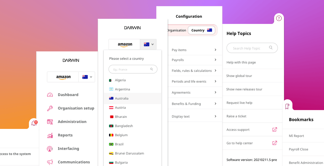
A restructured information architecture users could navigate with confidence.
Metrics coming soon.
Metrics coming soon.
Metrics coming soon.
Project Overview
Project Overview
The user problem
The tool's global reach, deep customisation and continuous feature releases had produced a convoluted navigation system: dozens of side-tab entry points, no progressive disclosure within each tab, and disconnected experiences across areas. Internal users, partners and client teams got lost, relied on browser search and multiple tabs just to get through basic workflows.
The business objective
Generative research identified navigation as the single most critical usability barrier across the whole product family, so the redesign scope was narrowed to it above every other feature, in order to unlock faster feature discovery, reduce support load and let the platform scale without navigation debt compounding further.
My role and scale of ownership
I led the navigation redesign end to end: running the generative research, defining the information architecture and navigation hierarchy, designing layouts, wireframes, mockups and prototypes, planning and running usability and tree testing, and codifying the outputs into reusable design-system components. As project lead I also set the architectural vision and documentation that let additional designers who joined the project onboard quickly and work autonomously within a shared navigation model.
How I got from insights to product value
Discover
Stakeholder maps, service blueprints, interviews, contextual inquiries and card sorting surfaced navigation as the platform's core usability barrier.
Define
Mapped the full information architecture and phased user flows, then defined a four-level navigation hierarchy.
Design
Designed six page layout templates, low- and high-fidelity wireframes, and interactive prototypes for every navigation level.
Deliver
Validated through usability and tree testing, then codified navigation patterns and layouts into the design system.



Execution
Execution
Understanding the problem
"Years of continuous feature releases had left the platform with no structure users could hold in their heads."
The redesign addressed critical navigation challenges within an existing configuration and administration tool used by internal users, partners and select client areas. The product's global reach, extensive customisation flexibility and continuous feature releases had produced a convoluted navigation system: dozens of side-tab entry points, no progressive disclosure within each tab, and disconnected experiences across different areas.
Discovery and definition
"Evidence from 60+ users across 4 countries replaced years of assumption, providing the structural direction the platform had never had."
Collecting and analysing the data
During the generative research phase, I worked with 60+ participants across 4 countries, using stakeholder maps to understand service actors with varying navigation-area access levels, a service blueprint to reveal interactions across service components, and user interviews, contextual inquiries and affinity mapping to identify the specific navigation issues that needed resolving. User personas clarified the need for accelerators and shortcuts versus step-by-step guidance.
Because so many of the insights concerned navigation, we ran a closed card sorting activity with 2 groups, giving them the main categories and features to group. Each group discussed their reasoning amongst themselves, then walked us through their proposal, and we compared the main similarities and differences across groups. This informed the categorisation decisions for concepts later evaluated with testing, and laid the foundations for the information architecture map designed after this phase.
All the details, process and outputs of the research phase are detailed in the case study Leading a multinational UX research initiative.

Closed card sorting activity.
The research showed participants became disoriented navigating the platform and couldn't locate specific features; found terminology confusing, which compromised feature accessibility; relied on Cmd+F browser search to locate content; used multiple tabs and incognito mode to multitask; and bookmarked pages due to how time-consuming navigation was for new and experienced users alike.
Main findings
| General navigation | Grouping related features in proximity, progressive disclosure, deep linking across connected actions, clear terminology, and global/contextual search and filtering. |
| Data access & management | Seamless access across organisational levels, and configuration reusability and comparison across organisations without workarounds like incognito sessions. |
| Cross-organisational configuration | Centralised access controls for standardised preferences and templates, and country-specific benefit templates in one unified settings area. |
| Employee search & identification | Rapid lookup by employee number, with quick confirmation via name, date of birth, start date and benefits, deliberately excluding sensitive data like salary. |
| Employee data preview | Previewing employee access rights and available benefits directly from the admin interface, instead of logging into a separate employee platform. |
| Unified navigation | A strong preference for consolidating the control centre and reward centre into one cohesive interface, despite early stakeholder interest in a decoupled, standalone-apps approach. |
Ideation and prototyping
"Turning a maze of side tabs into a logical structure that scaled with the platform instead of fragmenting under it."
Information architecture
Leveraging the research, I mapped the platform's IA through a comprehensive sitemap, developed with the product manager and reviewed with the software architecture team against technical constraints and feasibility.
The first iteration mapped every primary section, page and subpage, nested related areas per the card-sorting insights, and introduced clearer naming conventions where research had flagged confusion. I also built a summarised view of the structure to speed up stakeholder discussions and onboard new designers with a shared mental model.
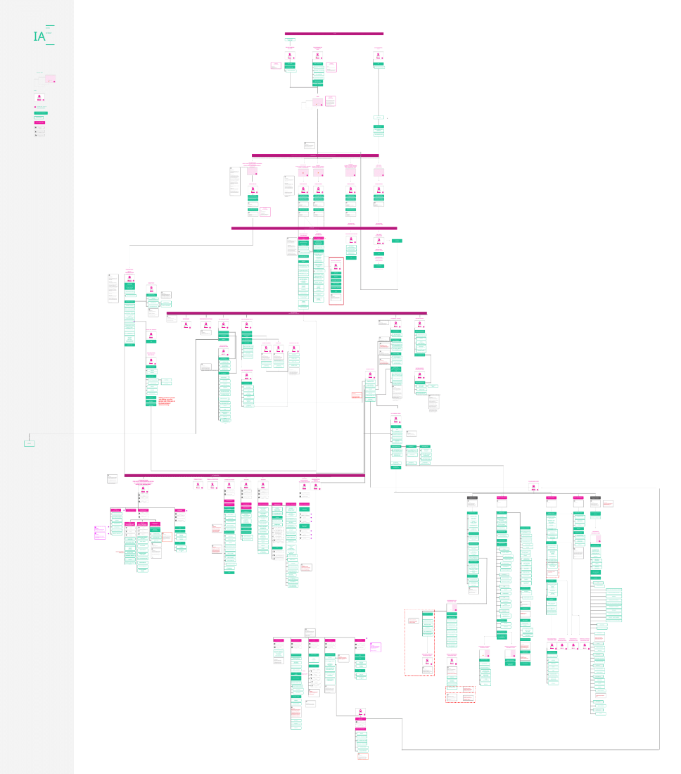
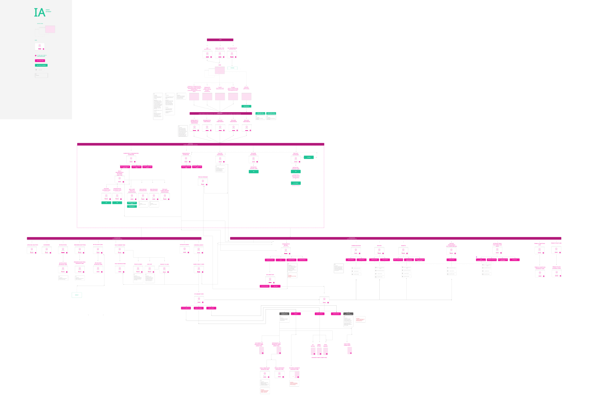
Detailed (left) and summarised (right) views of the main information architecture.
User flows
After the IA was agreed, I developed user flows for the platform's primary subsections, including dashboards and system settings, phased to match the project's multi-release delivery schedule. Each flow was reviewed and iterated with UX, product and engineering, which in turn informed refinements back into the IA. As additional designers joined, these flows and the navigation vision served as onboarding tools and consistency guidelines, letting the team work autonomously on their subsections while staying aligned to one architecture.
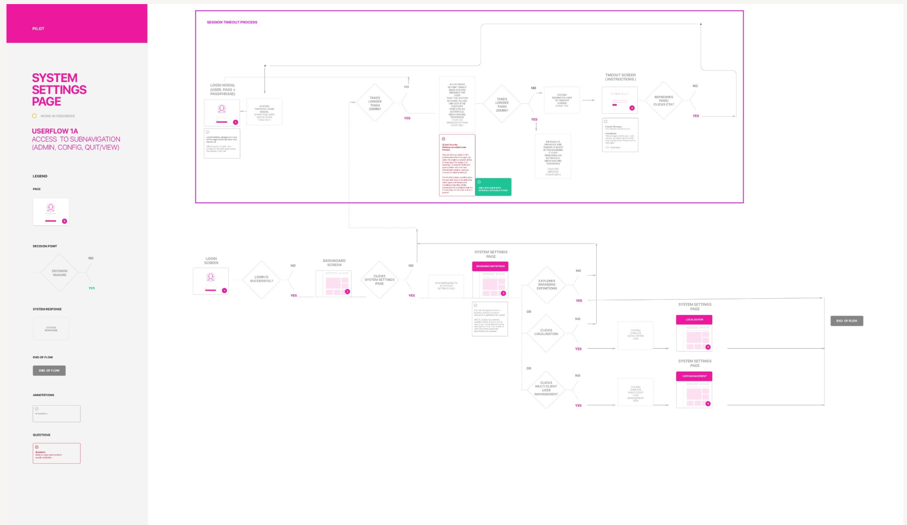
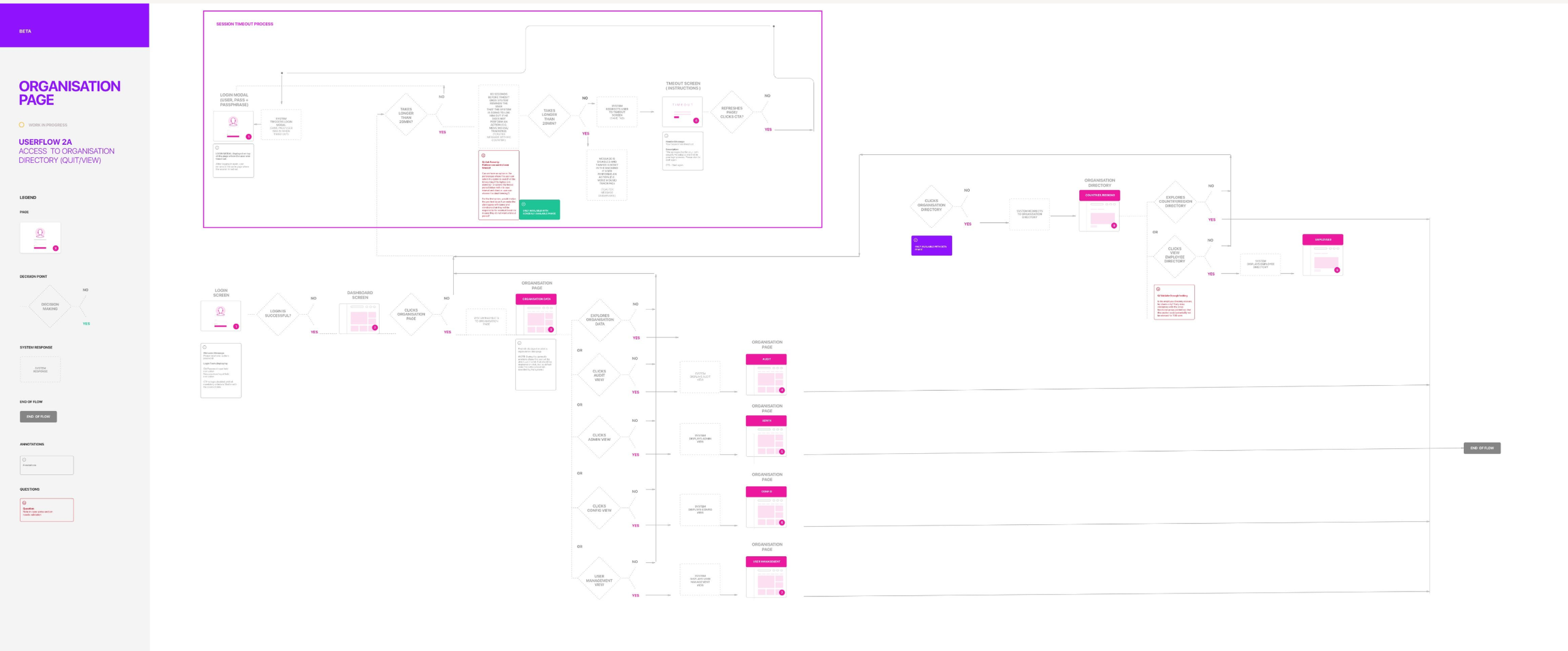
Examples of navigation flows implemented in phase 1 (left) and phase 2 (right) of the project.
Navigation system
"Four tiers meant every feature had a predictable home, and users could tell where something lived before they went looking for it."
Navigation hierarchy
To establish the navigation system I proposed a hierarchical classification, reviewed and approved by stakeholders, that gave each type of action and feature a predictable place in the structure.
Each tier was defined by the job it did rather than by the screen it sat on, so the same rules held across the platform as new features shipped.
Four tiers of navigation
| Top navigation | Global actions supporting multitasking, or features gated to power users. |
| Primary navigation | Main feature entry points, drilling into progressively disclosed features. |
| Secondary navigation | Dataset-based or feature-breakdown navigation. |
| Tertiary navigation | Introduced selectively on pages requiring intermediate categorisation. |

Top navigation and Primary navigation component iteration example.
Navigation layouts
To support this navigation system within application pages, I designed a comprehensive set of page layouts, each specifying which navigation tiers it carried and how content was arranged within it. This meant every new page had a template to start from rather than a bespoke layout decision, keeping density and navigation behaviour consistent as the platform grew:
Multi-card layout
For overview pages like dashboards, supporting primary, top and secondary navigation plus deep links into subsections.
Single-column layout
For simple content pages such as terms and conditions, supporting top and primary navigation with no deeper structure.
Two-column layout
For pages needing an extra navigation panel such as multi-step configuration, enabling top, primary, secondary and tertiary navigation.
Three-column layout
For data-intensive pages like employee profiles, supporting top, primary and secondary navigation with no tertiary tier.

Multiple template layouts supporting navigation with deep linking from cards, menus and independent links.
Low-fidelity wireframes
I developed wireframes integrating outputs from ideation sessions and design-studio workshops with multiple stakeholders, reviewed and iterated with the UX team, key stakeholders and engineering.
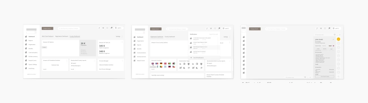
Early version of a dashboard wireframe using a multi-card layout combined with primary and top navigation.
Mockups and prototypes
I created low- and high-fidelity prototypes: the early-stage prototypes supported design reviews and iteration with stakeholders, and the high-fidelity prototypes were used for the usability testing described below.

Top navigation allowing users to explore global / multi task features

Primary navigation enabling access to feature set based on access rights and dataset selection (organisation or country)

Secondary navigation allowing users to explore features within each data set (cross organisation, single organisation and country). Views also restricted based on access rights.

Tertiary navigation allows users to quickly switch between organisation and country views for setup related data or provider related data.

Navigation layout templates enabling progressive disclosure of subsections within feature set.
Testing and delivery
"Testing settled the arguments: it validated a contested hypothesis and relocated the features nobody could find."
Usability testing
I ran usability testing across multiple phases of the navigation experience, defining the sample, hypotheses, protocol and note-taking format for each. For one study, I partnered with another team member on a joint testing and tree-testing protocol, splitting moderation and note-taking to minimise bias, then analysed the results together.
Examples of insights from testing:
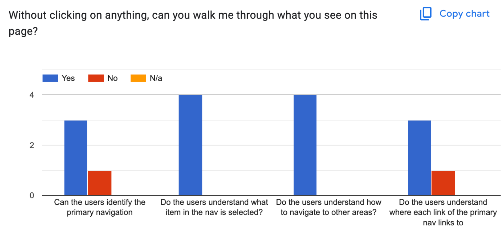
Two participants found the collapsed state of primary navigation unclear, so I introduced a hover state exposing all menu items on hover after analysing the testing results.
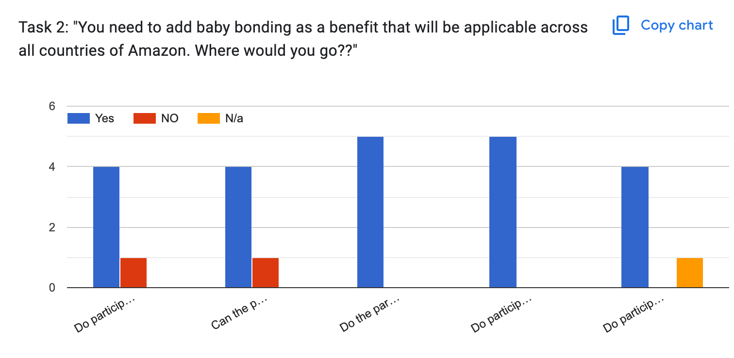
Most participants selected Organisation > Benefits, with only 1 expecting to define this country by country due to legacy behaviour. This confirmed the hypothesis that users expected bulk benefit configuration across countries, a pattern that had previously been challenged.
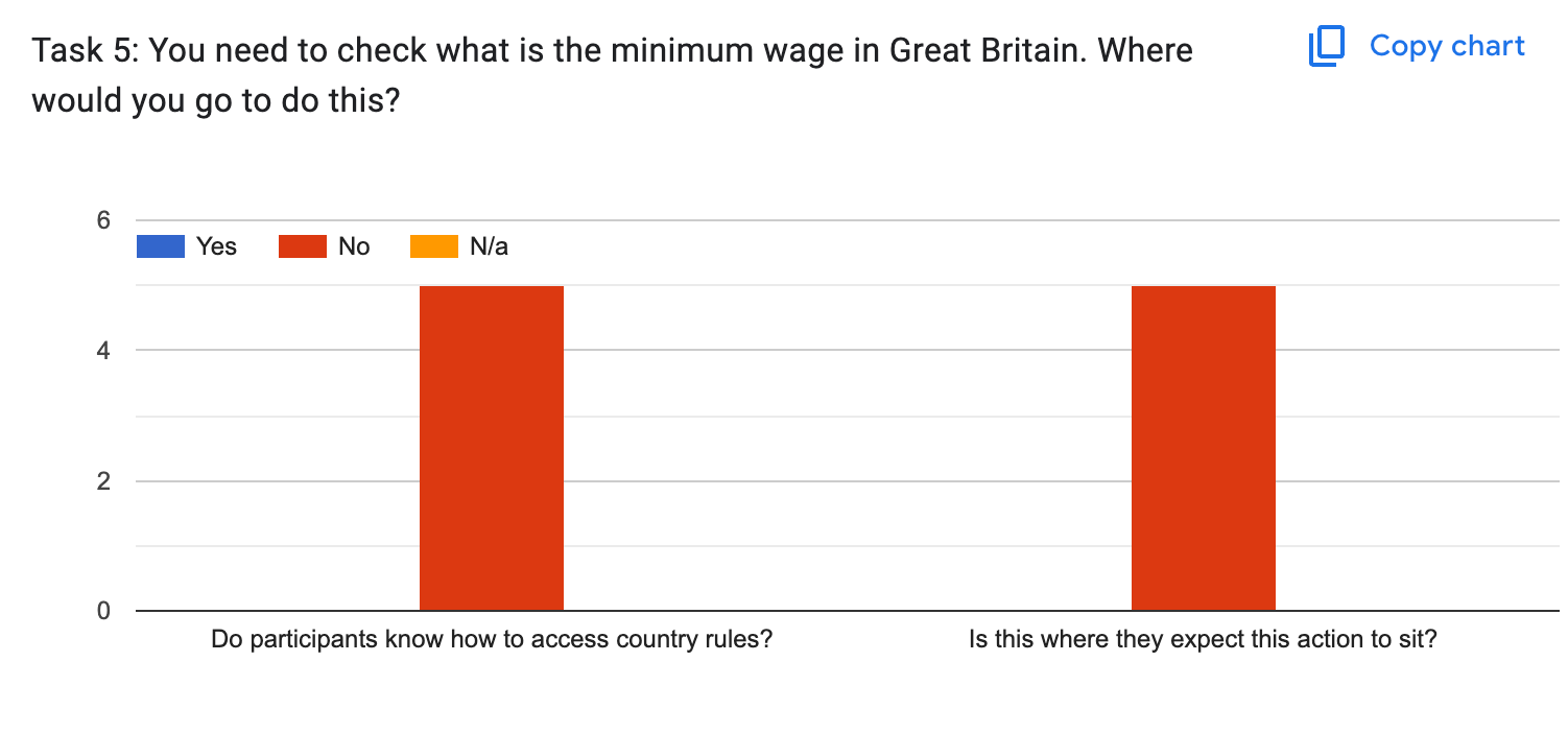
No participant could locate minimum wage within country rules, so I moved it under the Pay Items section after analysing the usability testing insights.
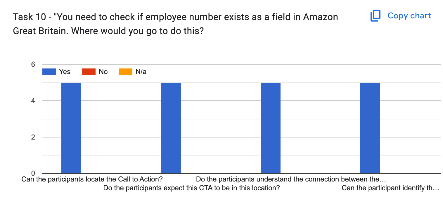
Employee fields location was clear to participants, who correctly understood it as an organisation-level configuration.
Design system
Building on the navigation system and layouts, I codified a comprehensive set of reusable patterns into the design system: individual components for each navigation type (top, primary, secondary, tertiary).
And a reusable template library covering every layout (single-column, form, multi-card, two-column, three-column and variations), giving engineering consistent, efficient components to implement across the platform.
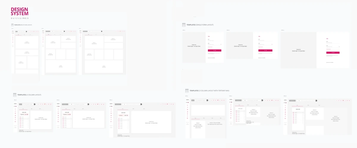
Template library in the design system guidelines, covering every layout variation.
Results & Business Impact
Results & Business Impact
From dozens of side tabs to a system users could navigate
The navigation redesign resolved the critical usability challenges surfaced in research: users no longer got lost in the complex system, terminology became intuitive, browser-search workarounds were eliminated, and reliance on multiple tabs and bookmarking dropped. Time to locate a feature fell, and the design system templates let the team implement new capabilities quickly.
Navigation tiers defined, from top to tertiary, each with its own component.
Reusable page layout templates handed to engineering as design system foundations.
Structural changes made directly from usability testing insights before build.
Terminology that matched mental models
A redefined hierarchy and clear labelling replaced confusing technical terminology, while an F-shaped pattern leveraged natural scanning behaviour for faster discovery and lower cognitive load.
Workarounds designed out
Grouping related features by dataset and function resolved the disconnect across platform areas, removing the need for Cmd+F searching, incognito multitasking and bookmarking just to get around.
"This foundational navigation work scaled with the platform's continued growth, turning a maze of dozens of side tabs into a system the whole team could build on."
A scalable design system foundation
Reusable navigation components and a template library gave engineering consistent parts to build with, enabling rapid, consistent implementation of new capabilities across the platform.
Decisions validated before build
Testing confirmed contested hypotheses, such as cross-country bulk benefit configuration, and relocated features users couldn't find, avoiding costly rework after implementation.