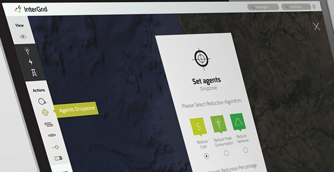
A technical control tool made legible for non-technical experts.
Vertical navigation replacing dispersed, scattered controls.
Custom icons designed to convey complex energy concepts at a glance.
Visual style guide, laying the foundation for a future design system.
Project Overview
Project Overview
The user problem
The technical prototype had a first approach to navigation, but it clearly needed a review of its information architecture. The existing navigation made it hard to easily find energy control hardware by location on a map, customise the type of energy algorithm used to calculate consumption, and analyse metrics for each device based on the algorithm applied.
The business objective
Enhance the experience of an existing capability-driven prototype so it could be used by less technical experts, widening who inside the business could safely operate the platform's hardware and algorithms.
My role and scale of ownership
InterGrid is an energy management desktop app designed to control a set of hardware tools that let energy companies manage both renewable and conventional energy sources. I owned this redesign end to end: research and definition, navigation and IA, wireframing through to high-fidelity UI, a custom 100+ icon set, and the visual style guide that underpinned delivery.
How I got from insights to product value
Discover
Proto personas and user needs, built with stakeholders, established a shared understanding of who the tool was for.
Define
Main tasks related to energy efficiency management were turned into user stories to guide the redesign.
Design
Revised the IA and user flows, then evolved low-fidelity wireframes into high-fidelity screens.
Deliver
Guerrilla-tested mockups, a custom 100+ icon library and a visual style guide handed to engineering.


Execution
Execution
The tech prototype exposed InterGrid's core complexity: it's an agentic system, autonomous agents deployed across hardware, each running a configurable reduction algorithm, but its first-pass navigation buried that power. Users struggled to locate agents on the map, choose and customise the algorithm each agent should run, and read the metrics each algorithm produced.
Discovery and definition
Collecting and analysing the data
The methods I used to collect and analyse the data were:
- User personas
- User needs
The first part of the project involved gathering information about the profile of the typical user who would use the platform, and about their daily routine. These proto personas were created with project stakeholders and helped us get a shared understanding of who we were designing for.
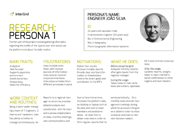
Persona 1: Engineer João Silva, a 20-year environmental engineer leading a team of 7 engineers, 2 interns and 1 assistant.
What this persona demanded from the design
Always busy and efficiency-driven, already juggling multiple cluttered corporate tools, with no patience for a navigation that added a fifth.
Needs to read what an agent and its algorithm are doing fast enough to log variations, spot outliers and file recurring reports.
Presents InterGrid on a tablet to non-technical decision makers in monthly reviews, so agent and algorithm states had to read clearly at a glance, not just to an engineer.
The next step was done in partnership with the relevant stakeholders, who assisted in defining the main user needs that users would need fulfilled while using the platform. We gathered the main tasks related to energy efficiency management and transformed them into user stories.
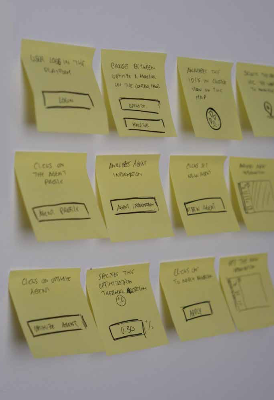
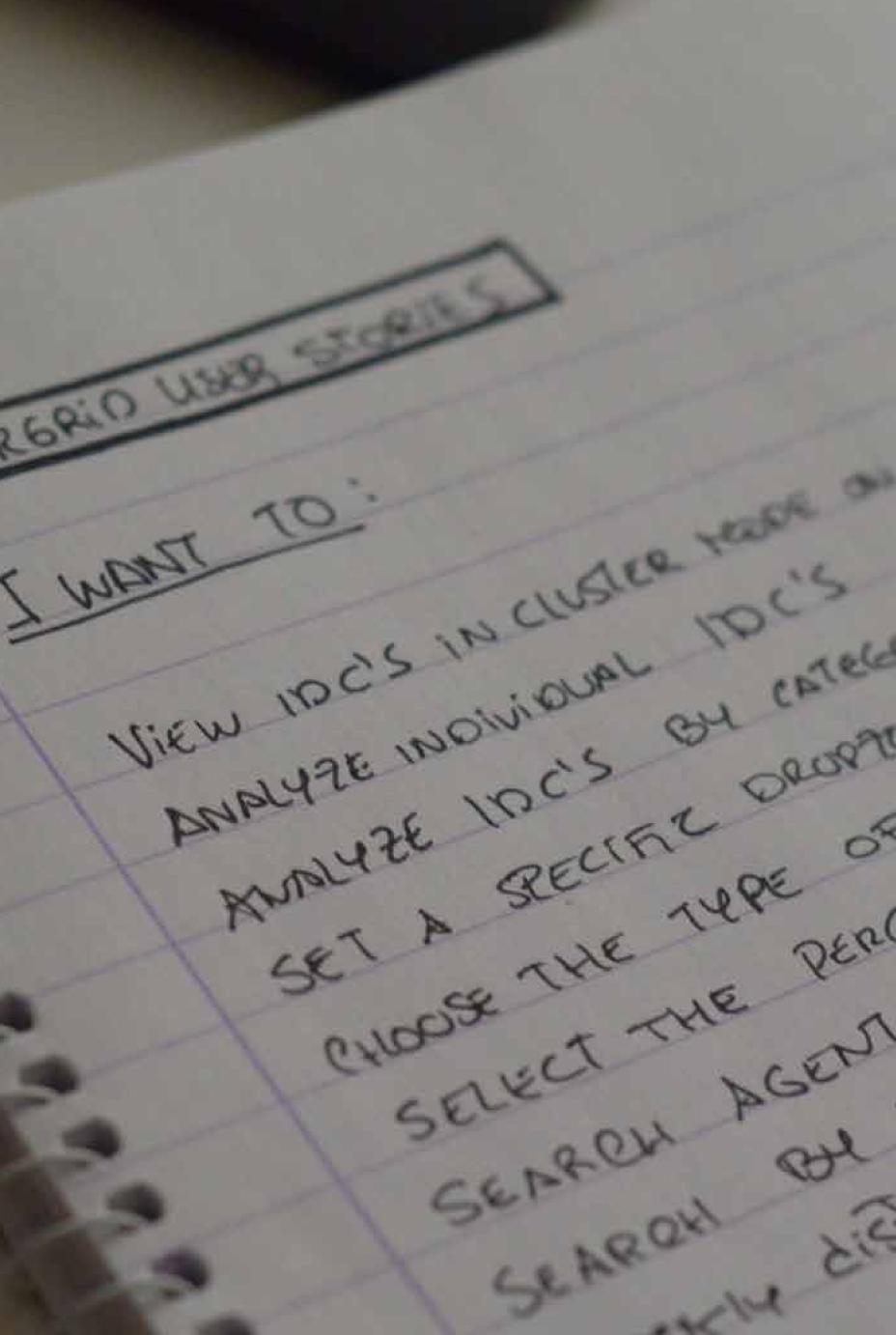
User stories, framed as "I want to": view IDCs in cluster mode, analyze individual IDCs, filter by category and type, search agents by distance.
Ideation and prototyping
Defining a navigation system
The next step was to revise the navigation with the understanding of the user needs, the direction of the proto personas and insights from the main stakeholders. This involved:
- Reviewing the information architecture of the technical prototype
- Defining user flows
User flow, sketched from login, through choosing to optimize or monitor an agent on the map, to setting and applying a thermal optimization algorithm.
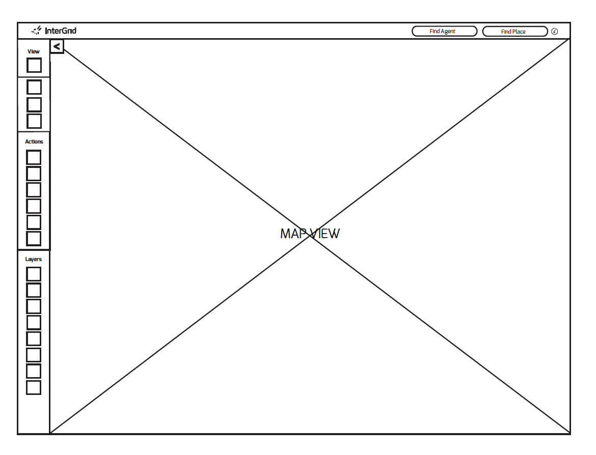
Low-fidelity wireframe of the map view, laying out the View / Actions / Layers navigation groups.
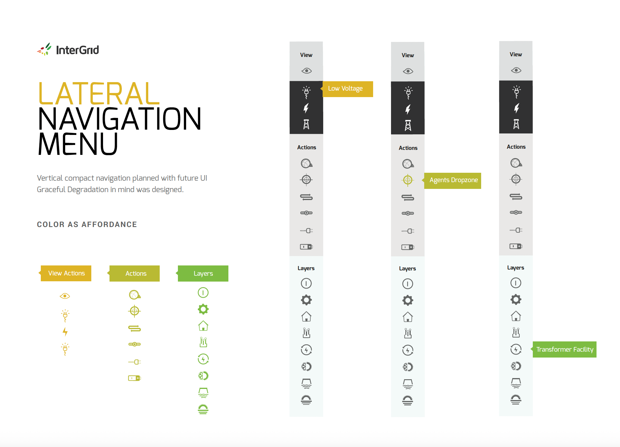
A vertical, compact lateral navigation menu, designed with future graceful degradation to smaller devices in mind, using colour to signal state (View Actions, Actions, Layers).
Every navigation decision had to make an inherently technical system, agents deployed against configurable reduction algorithms, legible to a team lead who managed the grid, not the software engineering behind it.
Generating concept ideas
Once the journey mapping was complete, the next step was the concept stage. During this I produced:
- Low-fidelity wireframes
- High-fidelity wireframes
I analysed the navigation of the technical prototype and redefined it using low-fidelity wireframes, then reviewed these with the main stakeholders of the project, including the engineering team. After final reviews and agreement, I evolved these into high-fidelity wireframes to better convey the layout and affordance of elements on the page.
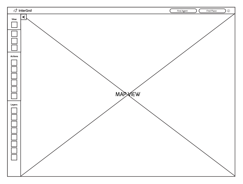
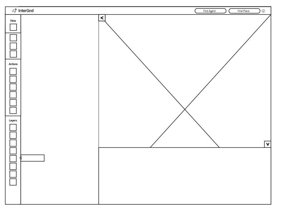
Low-fidelity wireframes: the map view with its detail panel open and collapsed, testing how much space the map itself needed to stay usable.
Testing and delivery
Once the high-fidelity wireframes were created, I moved on to validation and subsequent delivery. The methods and outputs generated during this phase were:
- Mockups
- Guerrilla testing
- Style guide
- Iconography library
Mockups
Based on the insights, I elevated the wireframes to mockup stage by defining layout, typography and iconography.
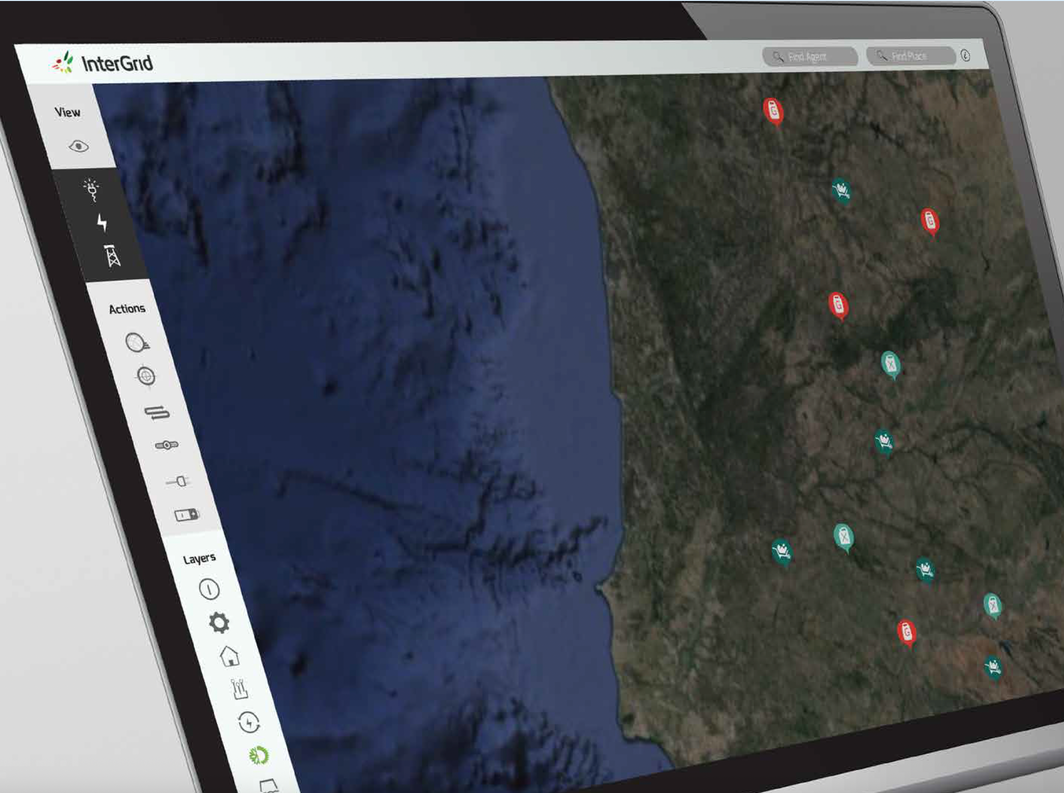
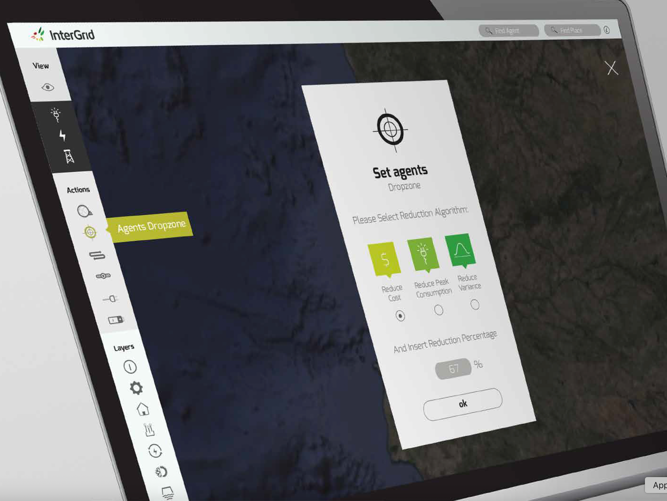
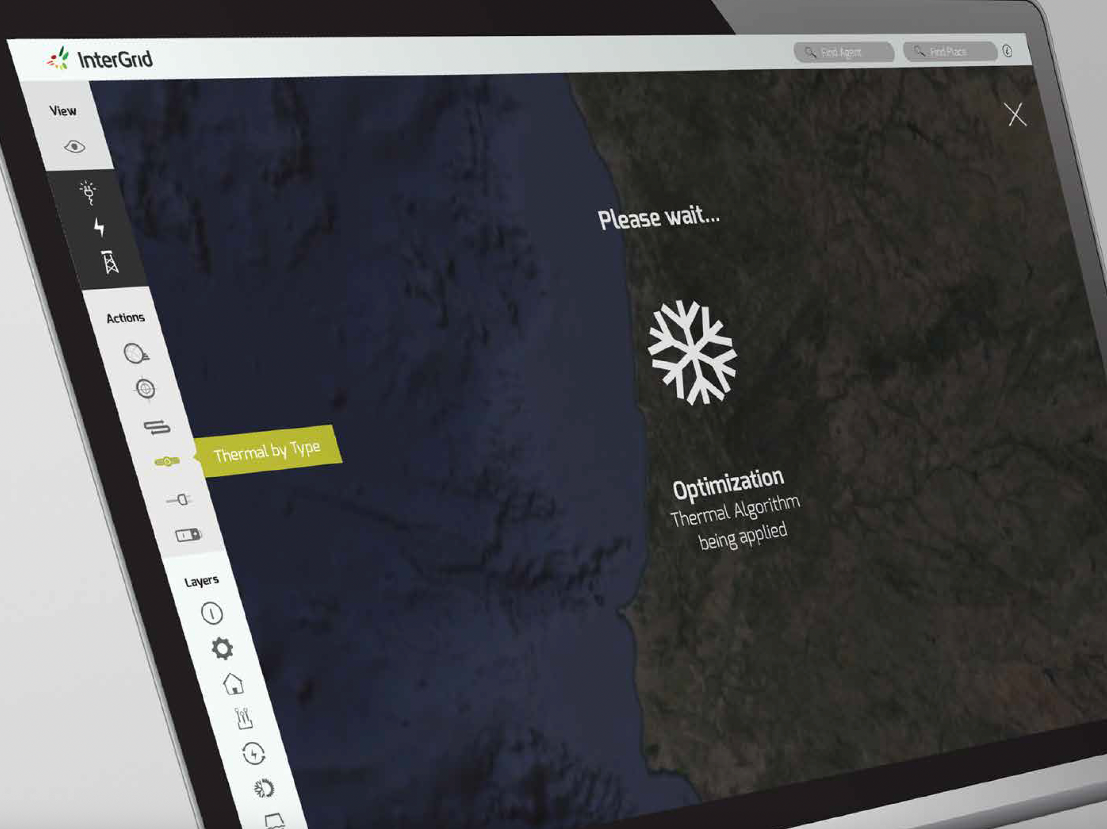
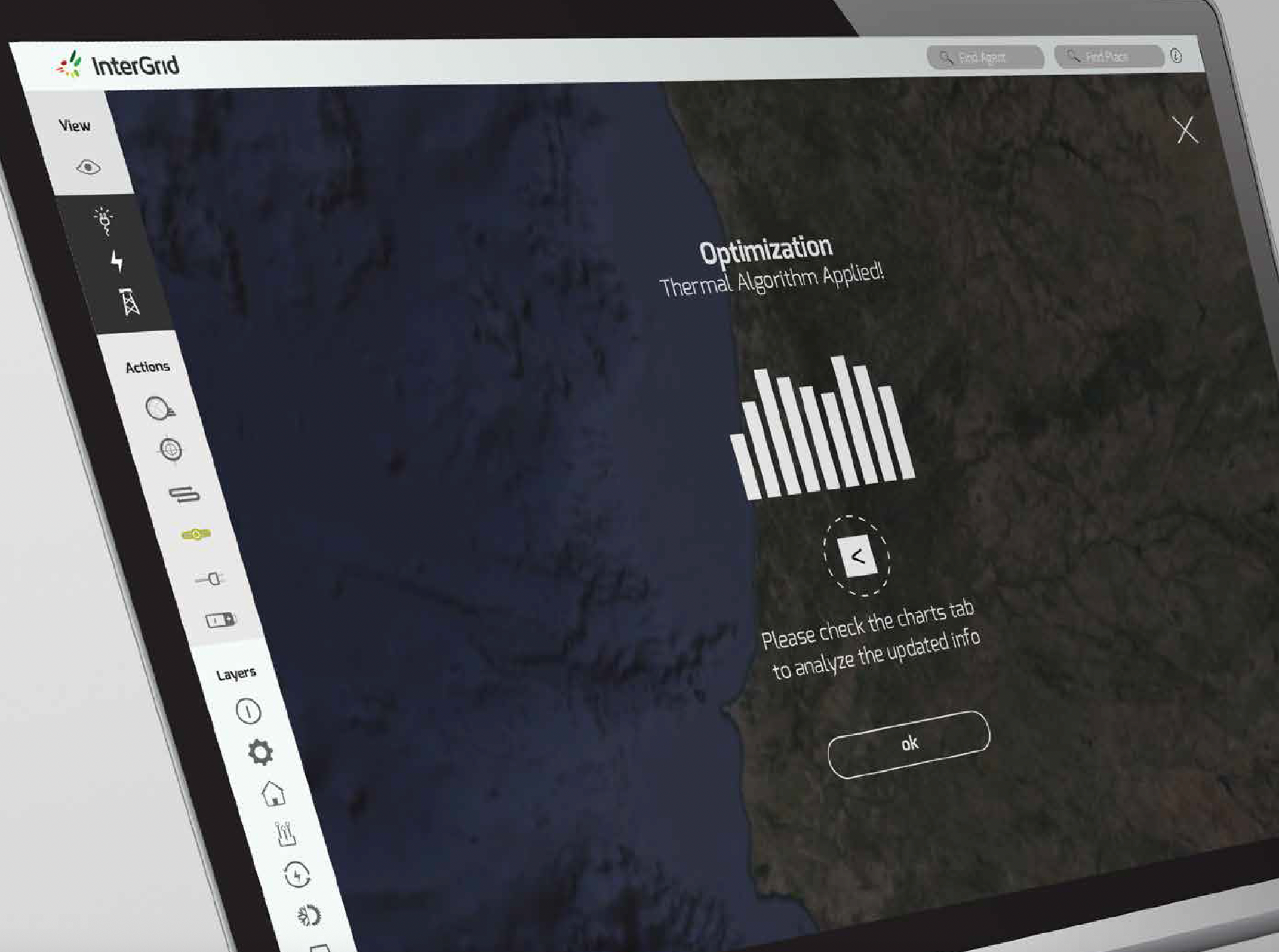
The map view, the agent set-up flow, and the optimization loading and applied states.
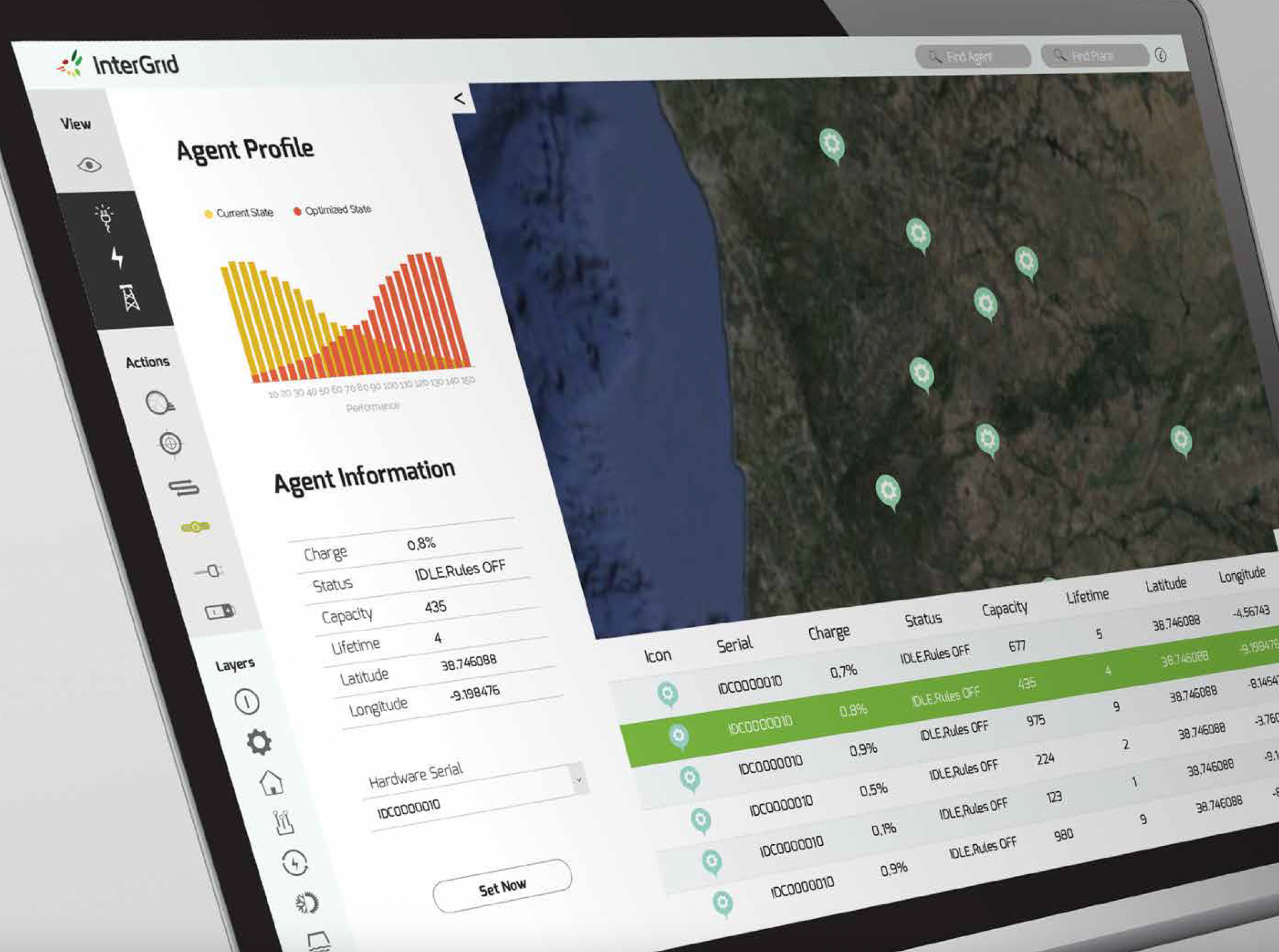
Agent profile: current vs. optimized state, alongside the full device table.
Guerrilla testing
I ran quick guerrilla testing sessions, asking internal participants to review the new experience via a follow-up survey, testing whether the agent- and algorithm-driven flows read clearly without a technical walkthrough. Three findings drove the next iteration:
Guerrilla testing findings
UX copy: algorithm and agent labels needed plain-language names before participants trusted what they were selecting.
Affordances: it wasn't obvious an agent's algorithm could be reconfigured mid-flow, so a persistent edit affordance was added.
Iconography: several consumer and generator pictograms needed more literal metaphors to be read at a glance.
Visual style guide
I provided a visual style guide to support implementation, which could be used as the foundation for a future design system.
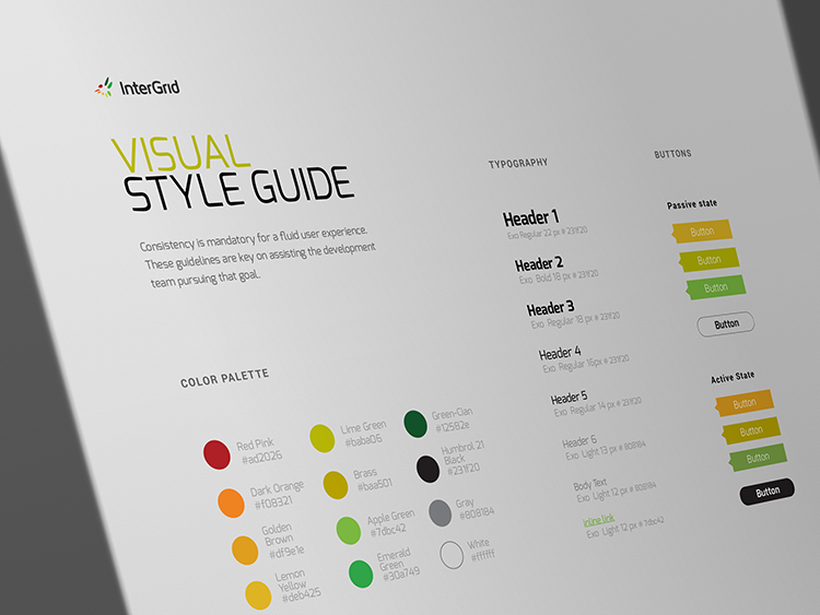
Colour palette, typography scale and button states.
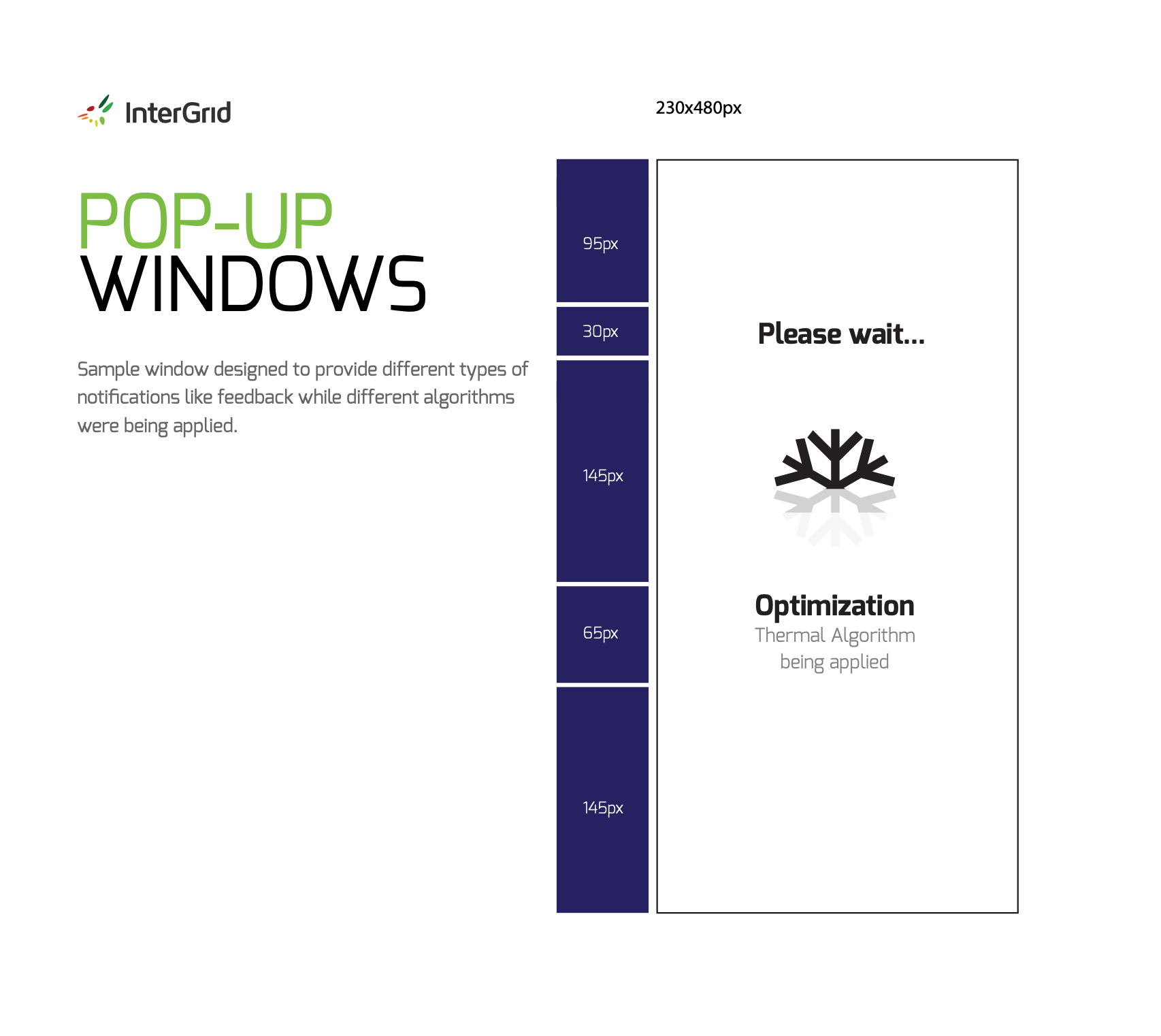
Pop-up window spec, sized to provide feedback while algorithms were being applied.
Iconography library
I also created a custom set of 100+ icons, requiring prior research into multiple renewable energy topics in order to convey the desired meaning in each pictogram.
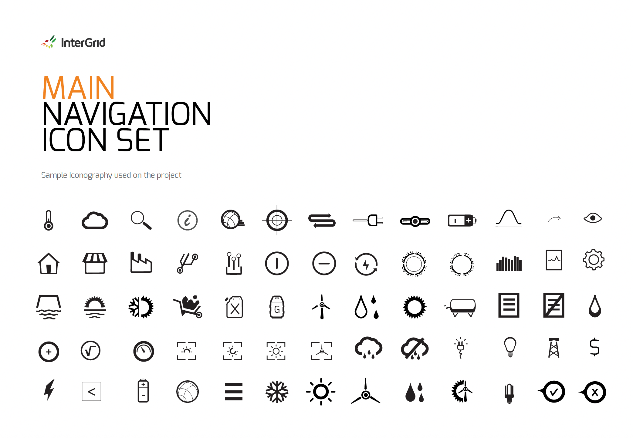
Main navigation icon set.
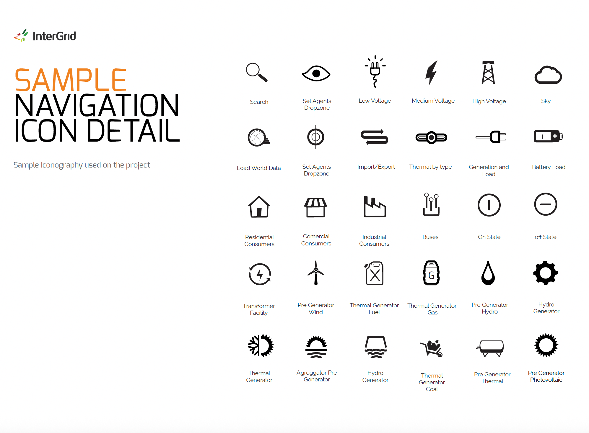
Sample navigation icon detail: voltage states, consumer types and generator types.
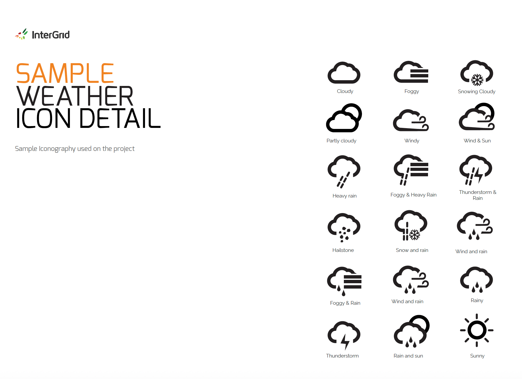
Sample weather icon detail, used to contextualise renewable generation on the map.
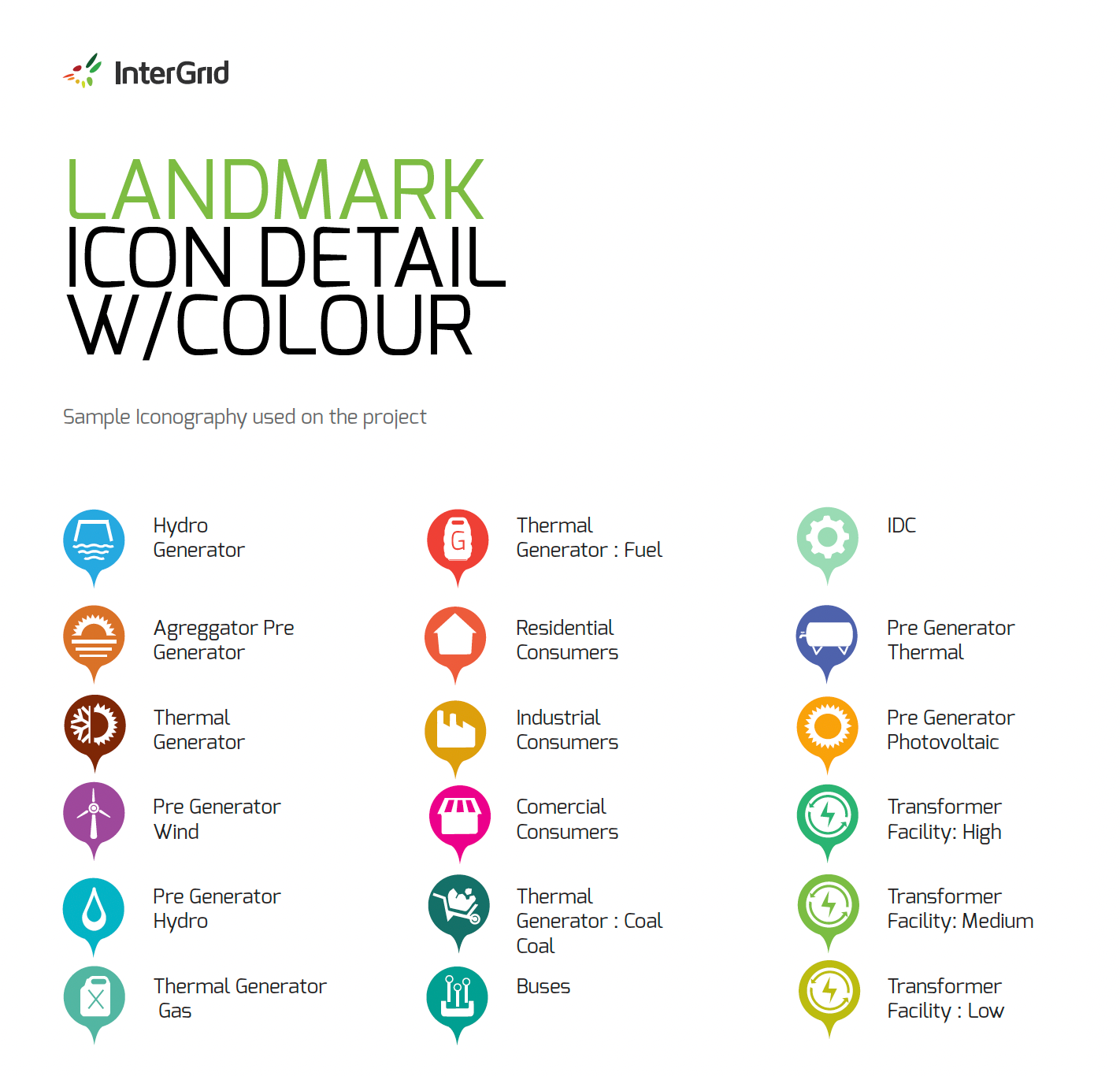
Landmark icon detail with colour, used to distinguish device and consumer types as map pins.
Results & Business Impact
Results & Business Impact
A technical tool made clear enough for non-technical experts.
The redesign improved the navigation and progressive disclosure of functionalities, making features clearer to the user. It made better use of screen real estate and provided clearer, faster understanding of features, despite the complex and technical nature of the tool.
Revised IA, aggregating dispersed functionalities into one vertical menu.
Custom icons supporting navigation and wayfinding.
Levers that drove the improvement: IA, colour and iconography.
Navigation, aggregated and future-proofed
Revising the information architecture meant aggregating dispersed functionalities into a single vertical menu, while also preparing the interface for future graceful degradation to smaller devices (the app was desktop-only at the time).
Colour as affordance
Using colour coding throughout the new navigation improved not only affordances but also the understanding of features.
"A custom iconography helped manage all the navigation and assist wayfinding throughout the platform."
Access widened beyond experts
A capability-driven prototype built for technical specialists became usable by less technical experts, widening who inside the business could safely operate it.
A reusable style guide
The visual style guide gave the development team consistent foundations to build from, and a base for a future design system.
A validated iteration loop
Guerrilla testing surfaced quick, actionable fixes to copy, affordances and pictogram clarity before handoff to engineering.