A companion app for finding and saving recipes, and snapping a meal to estimate its calories.
Data-driven personas built from 6 structured interviews.
Testing participants sampled across ages, genders and nationalities.
Tap to a calorie estimate: point, shoot, done.
Project Overview
Project Overview
The user problem
The 99kcal website let users locate recipes but was fairly restrictive in the flexibility it gave them: no way to save recipes conveniently, no control over their own data on-device, and no way to customise the experience to their tastes.
The business objective
Extend the 99kcal.com lifestyle project into a companion app where users could easily find recipes tailored to a low-calorie diet, save them conveniently, and understand which ingredients suited a calorie-restricted lifestyle. Beyond that, I wanted to find out how far technology could take the counting itself: where the phone could do the work the user was doing by hand.
My role and scale of ownership
I designed the 99kcal.com lifestyle brand and experience owning research, information architecture, user flows, wireframing, prototyping, guerrilla testing and final mockups, including the app's photography and content.
How I got from insights to product value
Discover
Heuristic evaluation of competitor apps and 6 structured interviews shaped 3 core user personas.
Define
Expressive scenarios captured user needs and shaped the sitemap and user flows.
Design
Hand sketches evolved into high-fidelity wireframes and an interactive prototype.
Deliver
Guerrilla-tested mockups, iterated on findings, and produced final photography and content.


Execution
Execution
The problem with the website
The website let users locate recipes, but gave them little control: no way to save data on their own device, personalise the experience, or keep coming back for more than one lookup. The app needed to solve three things: recipes tailored to taste, easy return to what they'd already found, and a reason to open it again.
Who I designed for
A heuristic evaluation of competitor recipe apps set the baseline for table-stakes features. From there, 6 structured interviews on weight-loss routines and recipe habits shaped 3 user personas and the needs behind them.
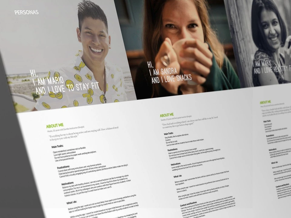
3 personas, each with traits, frustrations, motivations and current behaviour.
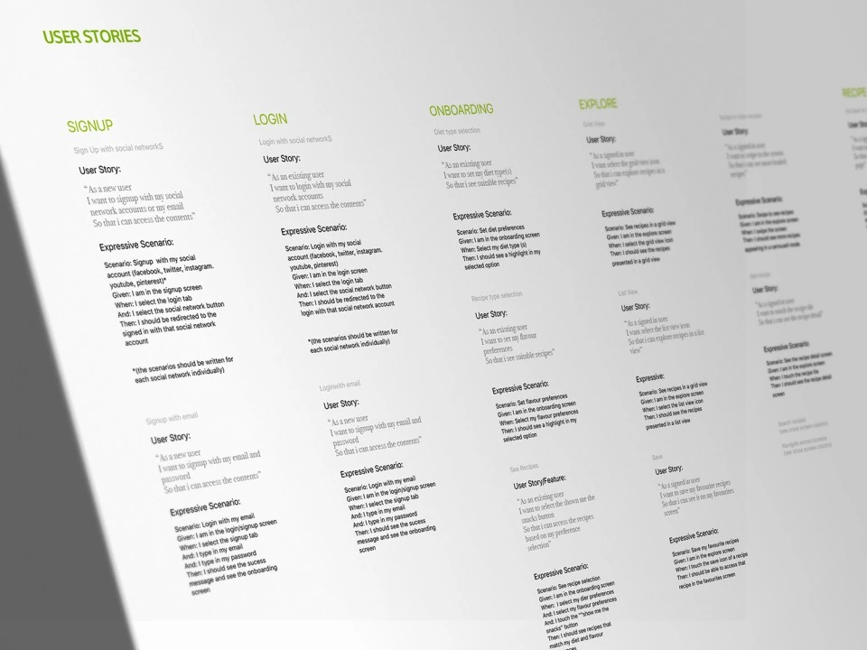
The clearest signal: users wanted to search by ingredient or diet, not just recipe name, and to return to recipes they'd already found. Calorie-swapping ingredients and a running shopping list came up just as often. Each need became an expressive scenario, feeding directly into the flows and later testing.
From sketch to flow
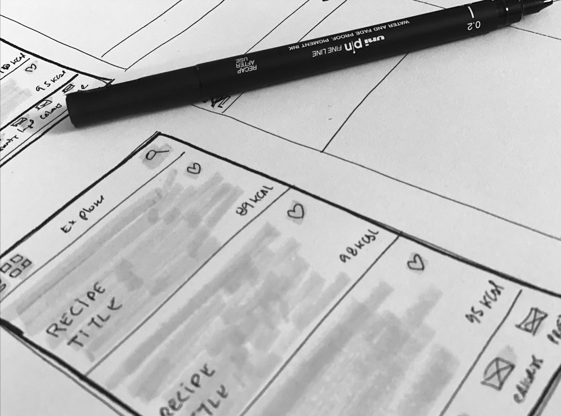
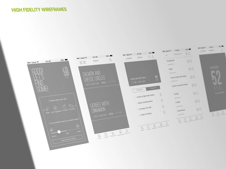
The needs research set the entry points for a sitemap covering every feature, with deep linking connecting related journeys across the app. User flows, drafted from the expressive scenarios, mapped every use case and decision point, and from there hand sketches materialised the concept fast and cheap before moving to high-fidelity wireframes and a working prototype to test the interactions directly.
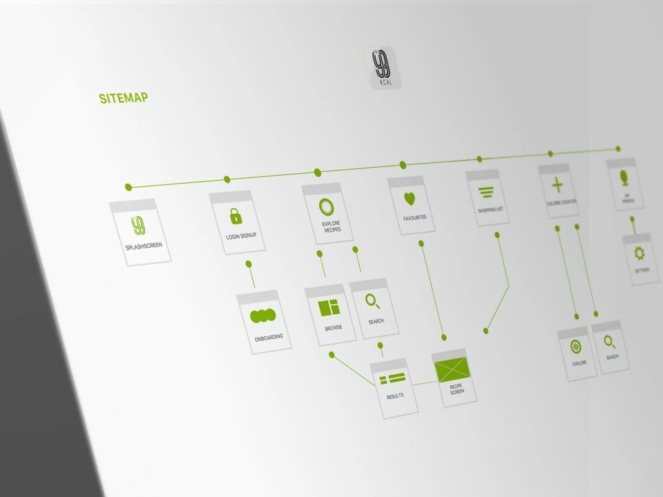
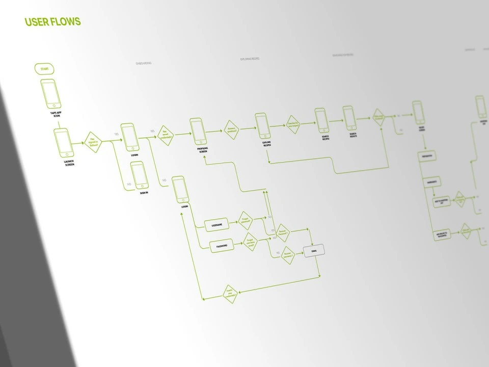
Information architecture: sitemap.
Elevating the wireframes to mockups
Before putting anything in front of users I raised the wireframes to full-fidelity mockups: real food photography, final type and colour, and production-ready states. Testing on something that looked like a shipped app meant feedback landed on the experience rather than on missing visuals.
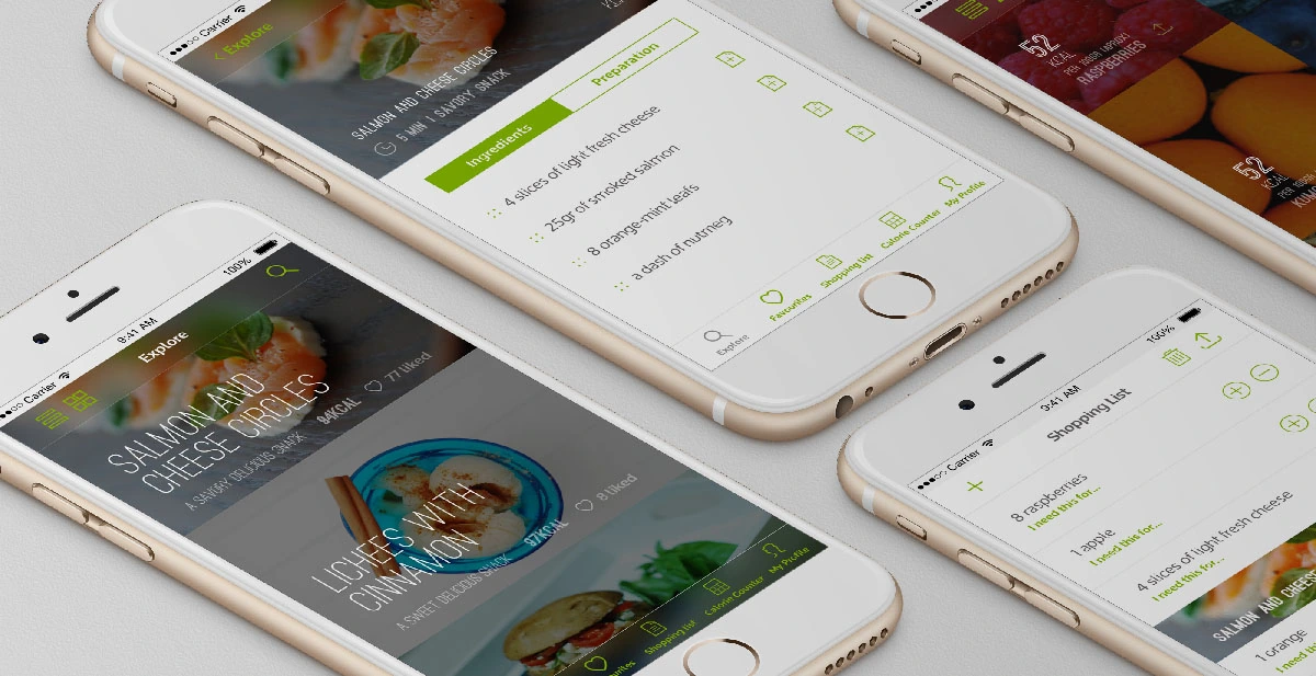
Mockups closeup: recipe screen and shopping list.
Evaluating with real users
Sample: 10 participants across age brackets, genders and nationalities.
Guerrilla testing on navigation, feature definition, CTA placement, affordances and UX copy surfaced concrete iterations and a set of requests for what to build next:
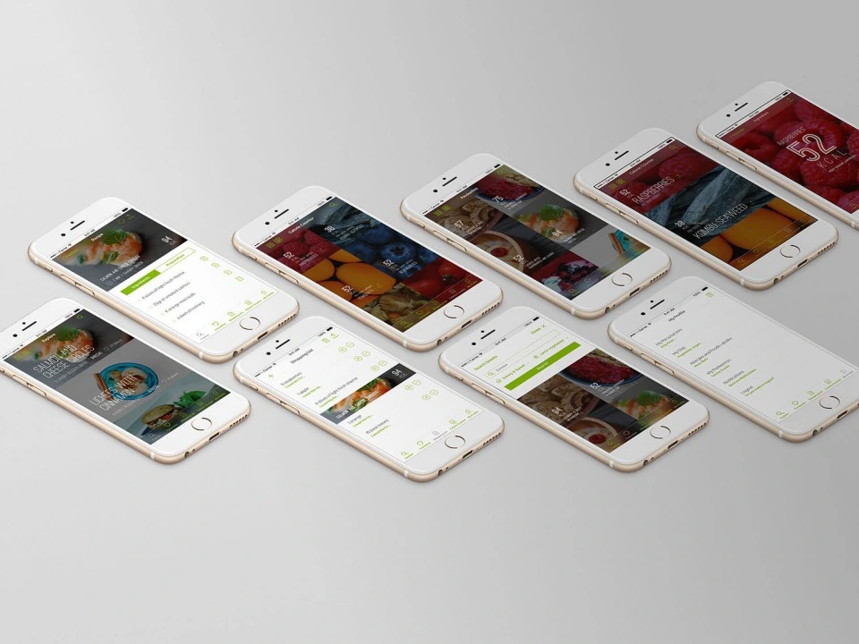
Final mockups, incorporating the guerrilla testing iterations.
Testing insights
Grid and landscape views appreciated for flexibility
Need to link ingredient list to saved recipes
Shopping list appreciated for efficiency
Need to snap a picture to extract a calorie count
Need to change units in my profile
Need to filter by allergens and foods I dislike
Calorie count per recipe in explore too small
Need to add a custom ingredient to the shopping list
Reduce noise from bold number counts
Need to share a recipe with others
Need to sort recipes by popular and quickest
Post-testing iterations
The photo-based calorie counter became the strongest signal for what to build next: it addressed a real point of friction guerrilla testing exposed, not a guess.
The final flow allows the user to point the camera at a plate or a recipe page, shoot once, and get an estimate back with what the app recognised and how confident it was.




Capture, recognition and confirmation, reworked pass by pass.
The final flow for snapping a picture and extracting a calorie count, shown full screen and across the full range of device sizes.
Vibe-coded in Claude, one source of truth
Changes were centralised in the design system rather than patched screen by screen. A comment left directly on a component - or on the prototype itself - is sent to Claude, which applies the change at the token or component level and propagates it back across every screen and device size. Editing in context and editing the system became the same action, so the prototype and the system never drifted apart.
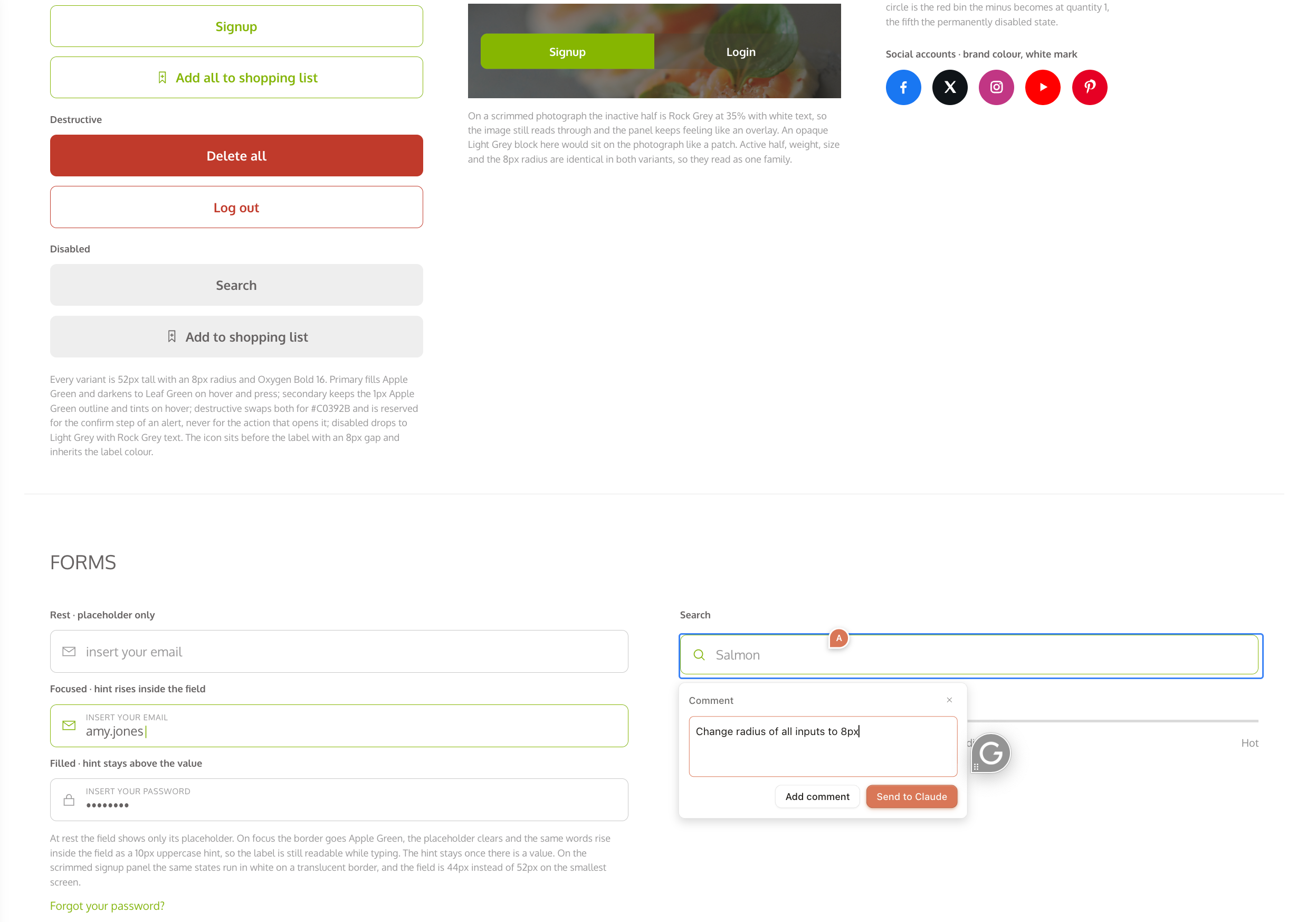
Edit made in the design system: a comment on the component itself.
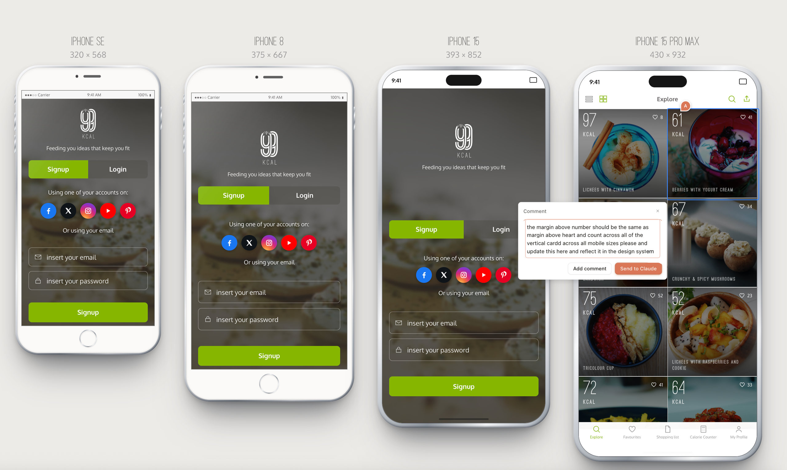
Edit made in context on the prototype, then centralised back into the design system.
The design system is not a document about the app, it is the app's parts: two typefaces with one job each, a single spacing scale, one radius and one stroke weight, and the components and patterns the prototype actually renders. Because every screen is assembled from it, a decision made once - a colour, a radius, a label - lands everywhere at every breakpoint, which is what kept eight principles and four device sizes from drifting apart.
The design system every edit lands in: principles, foundations, components, patterns and motion.
The final flows
Five flows carry the app: signup and login, navigation across the tab bar, favourites and the shopping list, the calorie counter and the profile. Each one was built as a working prototype rather than a static screen, so the interactions, states and transitions could be checked in the hand before anything was called finished, and each was drawn at the largest device size and proved at the smallest.
Every screen was designed across the full range of device sizes, from iPhone SE (320 x 568) to iPhone 15 Pro Max (430 x 932)
Signup and Login
Navigation
Favourites and Shopping list
Calorie counter and My profile
Results & Business Impact
Results & Business Impact
Tested, iterated and polished from one source of truth.
Guerrilla testing confirmed the app served the needs it was built for, and set the queue for what came next. The strongest signal, estimating calories from a photograph, was designed through six passes, with every flow assembled from a design system that stayed in step with the prototype.
Data-driven personas built from 6 structured interviews.
Testing participants sampled across ages, genders and nationalities.
Tap to a calorie estimate: point, shoot, done.
Core needs, validated
Users could search, find and save a recipe without hesitation, and the shopping list and grid views were called out as the things that made it efficient. The smaller asks that came out of testing, units in the profile, allergen filters, sharing, sorting by popular and quickest, were logged and prioritised rather than guessed at.
One tap to an estimate
Searching a fixed ingredient library was the friction testing exposed, so the counter was rebuilt around the camera: point at a plate or a recipe page, shoot once, and the estimate returns with what was recognised and how confident it is. Six passes moved the answer off the photograph, cut confidence from three statements to one chip, and replaced a caveat with a portion control.
A path beyond the website
The app gave 99kcal.com the flexibility, data control and personalisation a browsing-only website could not offer, with five flows built as working prototypes and proved from iPhone SE to iPhone 15 Pro Max.
One system, every screen
A comment left on a component, or on the prototype itself, is applied at the token level in Claude and propagates across every screen and device size. Editing in context and editing the system became the same action, so the prototype and the system never drifted apart.
A backlog grounded in evidence
Testing translated straight into a ranked queue, from grid and landscape views and deep linking through to the photo-based counter, so the backlog was grounded in evidence rather than opinion.